|
Register | Blogging | Today's Posts | Search |
|
Thread Tools | Display Modes |
07-09-2022, 11:51 AM | #61 (permalink) |
Born to be mild
Join Date: Oct 2008
Location: 404 Not Found
Posts: 26,992
|
Two-color Technicolor
Process 1 Technicolor originally existed in a two-color (red and green) system. In Process 1 (1916), a prism beam-splitter behind the camera lens exposed two consecutive frames of a single strip of black-and-white negative film simultaneously, one behind a red filter, the other behind a green filter. Because two frames were being exposed at the same time, the film had to be photographed and projected at twice the normal speed. Exhibition required a special projector with two apertures (one with a red filter and the other with a green filter), two lenses, and an adjustable prism that aligned the two images on the screen. The results were first demonstrated to members of the American Institute of Mining Engineers in New York on February 21, 1917.[10] Technicolor itself produced the only movie made in Process 1, The Gulf Between, which had a limited tour of Eastern cities, beginning with Boston and New York on September 13, 1917, primarily to interest motion picture producers and exhibitors in color.[11] The near-constant need for a technician to adjust the projection alignment doomed this additive color process. Only a few frames of The Gulf Between, showing star Grace Darmond, are known to exist today. Process 2 Convinced that there was no future in additive color processes, Comstock, Wescott, and Kalmus focused their attention on subtractive color processes. This culminated in what would eventually be known as Process 2 (1922) (often referred to today by the misnomer "two-strip Technicolor"). As before, the special Technicolor camera used a beam-splitter that simultaneously exposed two consecutive frames of a single strip of black-and-white film, one behind a green filter and one behind a red filter. The difference was that the two-component negative was now used to produce a subtractive color print. Because the colors were physically present in the print, no special projection equipment was required and the correct registration of the two images did not depend on the skill of the projectionist. The frames exposed behind the green filter were printed on one strip of black-and-white film, and the frames exposed behind the red filter were printed on another strip. After development, each print was toned to a color nearly complementary to that of the filter: orange-red for the green-filtered images, cyan-green for the red-filtered ones. Unlike tinting, which adds a uniform veil of color to the entire image, toning chemically replaces the black-and-white silver image with transparent coloring matter, so that the highlights remain clear (or nearly so), dark areas are strongly colored, and intermediate tones are colored proportionally. The two prints, made on film stock half the thickness of regular film, were then cemented together back to back to create a projection print. The Toll of the Sea, which debuted on November 26, 1922, used Process 2 and was the first general-release film in Technicolor. Although successful commercially, Process 2 was plagued with technical problems. Because the images on the two sides of the print were not in the same plane, both could not be perfectly in focus at the same time. The significance of this depended on the depth of focus of the projection optics. Much more serious was a problem with cupping. Films in general tended to become somewhat cupped after repeated use: every time a film was projected, each frame in turn was heated by the intense light in the projection gate, causing it to bulge slightly; after it had passed through the gate, it cooled and the bulge subsided, but not quite completely. It was found that the cemented prints were not only very prone to cupping, but that the direction of cupping would suddenly and randomly change from back to front or vice versa, so that even the most attentive projectionist could not prevent the image from temporarily popping out of focus whenever the cupping direction changed. Technicolor had to supply new prints so the cupped ones could be shipped to their Boston laboratory for flattening, after which they could be put back into service, at least for a while. The presence of image layers on both surfaces made the prints especially vulnerable to scratching, and because the scratches were vividly colored they were very noticeable. Splicing a Process 2 print without special attention to its unusual laminated construction was apt to result in a weak splice that would fail as it passed through the projector. Even before these problems became apparent, Technicolor regarded this cemented print approach as a stopgap and was already at work developing an improved process. Process 3 Based on the same dye-transfer technique first applied to motion pictures in 1916 by Max Handschiegl, Technicolor Process 3 (1928) was developed to eliminate the projection print made of double-cemented prints in favor of a print created by dye imbibition. The Technicolor camera for Process 3 was identical to that for Process 2, simultaneously photographing two consecutive frames of a black-and-white film behind red and green filters. In the lab, skip-frame printing was used to sort the alternating color-record frames on the camera negative into two series of contiguous frames, the red-filtered frames being printed onto one strip of specially prepared "matrix" film and the green-filtered frames onto another. After processing, the gelatin of the matrix film's emulsion was left proportionally hardened, being hardest and least soluble where it had been most strongly exposed to light. The unhardened fraction was then washed away. The result was two strips of relief images consisting of hardened gelatin, thickest in the areas corresponding to the clearest, least-exposed areas of the negative. To make each final color print, the matrix films were soaked in dye baths of colors nominally complementary to those of the camera filters: the strip made from red-filtered frames was dyed cyan-green and the strip made from green-filtered frames was dyed orange-red. The thicker the gelatin in each area of a frame, the more dye it absorbed. Each matrix in turn was pressed into contact with a plain gelatin-coated strip of film known as the "blank" and the gelatin "imbibed" the dye from the matrix. A mordant made from deacetylated chitin was applied to the blank before printing, to prevent the dyes from migrating or "bleeding" after they were absorbed. Dye imbibition was not suitable for printing optical soundtracks, which required very high resolution, so when making prints for sound-on-film systems the "blank" film was a conventional black-and-white film stock on which the soundtrack, as well as frame lines, had been printed in the ordinary way prior to the dye transfer operation. Okay, so now you know. Or don't. I'm still confused. On we go. The first of Ising and Harman’s Happy Harmonies to feature anthropomorphic (you know what? I’m getting tired of writing that word: let’s just call them anthros from now on, okay?) animals seems to have been When the Cat’s Away (1935), which also happens to be in colour. The cat here, perhaps going against the later trend, is a female one and is lured away from the fire and out of the house by the amorous attentions of a tom, leading also perhaps to the first instances of cats singing onscreen in a cartoon? Possibly. The mouse then emerges, with a nod (intended or not I don't’ know) to Alice in Wonderland, from the tea pot and goes exploring, now that, well, the cat’s away. He locks the cat out and then goes back into the mousehole to invite all his friends out. It’s interesting that he is the only one you could call an anthro, with a voice and wearing denim dungarees, and using his “hands”, while the rest are, well, just mice, there to make up the numbers and I guess it was easy for the boys to just draw standard mice. The title of the film is literal: within a minute of its start the cat is gone from the cartoon, and the mice are running the show. It’s hard not to see the hand of Disney here, as the boys have the mouse turn on the cooker and the pots and kettles thereon begin singing and dancing, in a fashion very reminiscent of the whistles in Steamboat Willie. The cartoon also uses - maybe for the first time, but I sort of doubt it - the idea of “drunken music”. You know the kind of thing: someone gets pissed and starts staggering around and you have a violin played slowly and somewhat with a warp in the tune to make it sound like the instrument, or player, is drunk. I suppose the idea of mice getting (hah) rat-arsed would be frowned upon today, and no doubt the likes of the Temperance Society had much to say about such shenanigans, but then, these aren’t people but animals, so maybe they were told where to stick their high-minded concerns and comments, if they had them. Then, as would happen in many cartoons down the decades, there is conflict as the bad guy, a big muscly rat who bears something of a passing resemblance, I feel, to Popeye’s nemesis, Brutus or Bluto, enters the fray and tries to steal the mouse’s girl away. Unable to beat him on his own terms, the mouse uses guile: he jumps up to the window and lets the cat back in, who then chases the rat back into his hole. Cute. I want to see if I can see an appreciable difference between two and three-strip technicolor, and luckily I can here, as this cartoon was in two-strip, but after May of 1935 MGM changed to the more popular and upgraded three-strip, like in The Old Mill Pond (1936). And yes, right away I can see we now have blues and greens, which we didn’t in the other cartoon. It’s almost like looking at an old sepia photograph compared to a modern monochrome one. Not quite colour yet (though this is, but you know what I mean) but far sharper and clearer than the previous. This system, more than the other, deserves the epithet of technicolor. It’s interesting that the frogs sing in chorus here, making me wonder whether Paul McCartney knew of or saw this cartoon before penning “We All Stand Together”? If not, it’s another weird coincidence. Let me see if it says anything about it on Wiki. No, according to that, the song is based on a Rupert the Bear movie from 1983. Well, coincidence certainly, unless the makers of the movie are just not admitting their influence, or it’s not spoken of there. Again, the racism. These frogs are very definitely meant to be black people - the mannerisms, the walk, the dance, the music, the speech, the exaggerated lips and pure-white teeth. It doesn’t say who does the voices, but I’m willing to bet at this point they are white, despite the fact that black artists such as Louis Armstrong, Fats Waller and Cab Calloway are all, um, caricatured, it says here. Yeah it’s basically a musical performance. The animation is excellent all right, but there’s not a lot to write about. Another three-strip is To Spring (1936) which seems to concern some sort of hibernation ending, though the creatures look like gnomes or goblins or something - they are basic humanoid but have large pointed ears - who have been sleeping through the winter. The animation here is first-class, especially the passage of a droplet of water down several levels of a cave, till it hits the windmill arm of a cuckoo clock. I also like that when the main character wakes up and gets out of bed, his leg is asleep. Such attention to detail marks this cartoon out as particularly special. Whatever these creatures are, they appear to be trying to engineer the return of spring, like workers in a nature factory or something. It’s very well put together and the animation is very smooth. It also features something Disney would do a lot, which is to focus on one other, ancillary character, who is performing some act, and to keep cutting back to that character. Here, one of the little guys is trying, without success, to put his trousers on, and every time we go back to him he is still trying. The fairies, or whatever they are, battle a white ghostly figure - presumably meant to represent winter - and though they are at first repulsed they work together and beat him, allowing spring to come forth. Warners however turned out to be the true powerhouse of American animation, and with future legends such as Tex Avery, Friz Freleng and the “man of a thousand voices”, Mel Blanc, new characters began to pop up, the likes of which we still recognise today and who formed, at least for me, a major part of my growing up. The first new face was Beans the Cat, quickly superseded by Porky the Pig, both of whom debuted in the Merrie Melodies short I Haven’t Got a Hat (1935). I’m confused about this one. It says it’s in colour (and being 1935 you would expect it to be, at this stage) yet the only full video I can find on YouTube has it in black-and-white, and not only that, a sort of storyboard idea. There are colour clips, but they range from a few seconds to just over a minute. I can get the story from the b/w one but I can’t comment really on the animation unless I can see the full colour video, which I can’t, and this is a pity, as, like I say above, this is the debut of Porky Pig. Anyway, let’s see what we got. Well actually I have one here in colour that’s almost two and a half minutes long - that’s about a third of the actual film, not bad - but I think I have to say the colour is not as good as in, say, To Spring or even The Old Mill Pond. It looks a little washed out. Another thing that would become standard in cartoons is here, baby animals following their mother in lines, especially ducks (and of course one goes astray) and it’s also clever how the teacher, a cow, uses her cowbell to ring for the class. I rather expected the stammer would be added later to Porky Pig, but no, it’s here, although a little perhaps too pronounced, making it all but impossible to make out what he’s saying. In later incarnations he would just stutter over a few words, but here it’s almost every word. Beans the Cat is just a poor copy of Bosko; doesn’t even look anything like a cat. The full film is below, in that weird sketchy black and white I spoke of. The basic idea of a school talent show is a good one, gives the animators a lot of scope. A haughty owl plays a piano, two sheep sing the song “I Haven’t Got a Hat” (in case, like me, you were wondering where the title came from) and a very embarrassed and shy, um, something, hard to see in the sketch, recites Mary Had a Little Lamb. In the end of course, it all ends up in a schoolkid scuffle and fight, led by Beans the cat. Porky has just the one role in the cartoon and then is not seen afterwards, though he does take up the major part of it. Another trope to be taken up is the idea of someone’s voice speeding up to the point where it is virtually unintelligible, something we as kids used to do with records, to riotous laughter. Ah, ye had to be there. Ah right, I see this is a two-strip technicolor cartoon, which accounts for the washed-out look. Apparently Disney had the rights on the three-colour one until the autumn (fall) of 1935, and this was released in March. Interestingly, at the end it’s not Porky who says “That’s all folks” but a sort of jester figure, and of course the stammer at the beginning is yet to come.
__________________
Trollheart: Signature-free since April 2018 |
07-24-2022, 11:16 AM | #62 (permalink) |
Born to be mild
Join Date: Oct 2008
Location: 404 Not Found
Posts: 26,992
|
Ub Mice and Men: Mickey’s Parents Divorce
But no matter what we might say of this or that studio, and how one or the other, or a certain number of them would come to prominence and challenge their position as top dog, it’s a fact that even right into the twenty-first century Disney remains the “gold standard” and was largely responsible for what was termed the Golden Age of American Animation. We’ve already looked into the creator himself, but what of those who worked for him? Well, we have read about Ising and Harman, but a man more closely associated with the early Disney products, while not quite airbrushed from the history of animation, has nevertheless sort of been pushed a litlte into the background in recent years, but he is basically the one whom we have to thank, or curse, for the creation of Disney’s greatest and most famous character. Ub Iwerks (1901 - 1971) Surely the strangest name ever for an American animator, Iwerks was born in Missouri to German parents, hence I guess the odd name. His father was by all accounts what we would call today a bastard-maker, fathering children and leaving them and their respective mothers behind as another man might throw away a crisp packet when he was done. True to form, when Ub was born his father, then 57, fucked off and left him, and Ub never forgave him. On learning of his death, Ub was reputed to have opined that his father could be thrown in a ditch. I know how he felt. Ub met Walt Disney in 1919, the first to partner up with the father of American cartoons and together they opened a studio and created their first successful character, as already related, Oswald the Lucky Rabbit. When creative control of the character was taken from Disney, he and Iwerks began working on a new character, the rights of which the two would own. This was of course the most famous cartoon character in history. Life with Disney however was not by any means all roses, and Iwerks resented the fact that he was not getting the credit he deserved, not only on the creation of Mickey Mouse but on other characters too. He did, after all, single-handedly animate what would go on to become, until the release of Snow White and the Seven Dwarfs, the world’s most famous cartoon, Steamboat Willie, the first to use synchronised sound. Besides this, he found Disney’s style dictatorial, and so in 1930, after a particularly acrimonious spat, he left to set up his own studio. It was not, to be fair, successful, and again to be fair, or not, Disney did not fall apart without him, even though many believed Iwerks to be the real genius. Walt Disney hired other animators, and the studios continued to grow and influence the emerging animation market, eventually becoming the colossus it is today. Iwerks, in the meantime, created a new character, Flip the Frog, who would star in over thirty features from 1930 to 1933. He also created others, but Flip was supposed to be his main one, his Oswald or Mickey. As already explained, his ex-boss had an exclusive contract to use the three-strip technicolor system so Ub, like other animators in other studios, was constrained to the two-colour, and it shows. The cartoon looks faded and washed out, though I consider the possibility that this may be the first time proper sound effects were used in a cartoon, such as the slide-whistle thing when the tortoise, with what would become typical cartoon logic, examples of which we have already seen in Plane Crazy and Trolley Troubles, and even the Felix the Cat cartoons, extends its shell like a scissors lift and ejects him off it. The sound synchronisation, though minimal, is quite impressive. I see he rather cheekily included some mice who bear a striking resemblance to Disney’s main character, down to the white gloves and red shorts, but then, since he was also involved in the creation of Mickey Mouse, why not? The cartoon seems to use little if anything in the way of speech or voices, despite the original sort of singing by Flip, and relies mostly for its sound on music and sound effects. This, I suppose, was in order to make it easier to animate. If you don’t have the characters talking, you don’t need to worry about lining up the words with the movement of their mouths. Overall I can see how Fiddlesticks wasn’t successful: it’s good animation but basically it’s over twelve minutes of watching a frog and various animals play music and dance, and let’s be fair, this has been done before. And better. Did it improve with time? Let’s see. Two years on we have Flip and the Milkman, famous (or infamous) for using so-called curse words. Well, I can’t say for sure, but the version I can find is in black and white, and I have to say at this point I already dislike Flip the Frog with an intensity I haven’t experienced for other cartoon characters. He’s just very annoying, and not in a comic way. Anyhow, let’s see how this plays out. Well it may be the first time the sun is anthropomorphised, haven’t seen that before that I remember, and for a kid’s cartoon yeah, it is quite violent, and with speech this time, not just sound. I must say though, Flip looks so much less like a frog now than he did in 1930, and you can certainly hear Mickey’s voice in his. The idea of another character Ub created for Disney, Clarabelle Cow, is again explored here, and while Flip has the high-pitched voice of Disney’s star, the insect on the cow who backtalks him has a thick Bronx accent or something, very deep and masculine. Two flies coming with a stretcher to take away the squashed one (with attendant Death March music on maybe kazoo) is clever, though again slightly dark for children? This sort of thing would of course become a mainstay of shows like Roadrunner and Tom and Jerry in time to come, but quite brave, I feel, in 1932. Early usage, too, of “action lines”: Flip passes a dustbin in which a child is hiding and it vibrates with his cries, the line showing that it’s moving, and also tears flying from the child’s eyes. The cartoon logic comes into play when, as one milk bottle falls from the window sill of one of the houses, the other comes to life and catches it, smiling as it resettles it on the sill. Cute when the “bad word” is said - “What the hell do we care?” - it’s said by the horse pulling the milk cart, and Flip tells it “mustn’t say that bad word.” Kind of giving the censor the finger there, Ub! Yeah, a lot better: much more going on and despite the very limited speech and the lack of colour, quite entertaining. Let’s cut to the end, to Flip’s final cartoon, released in 1933, so still stuck on those two-colour - oh. No. Still in black and white, according to YouTube. Hmm. Soda Squirt sees Flip opening his drug store, and I don’t know what the rules were on copyright at this time, but Ub has caricatures of Laurel and Hardy, the Marx Brothers and possibly Mae West? Some Hollywood screen goddess anyway. A little risque for the times, as Flip, obviously into her, holds an ice cream cone and it melts in his hand. Oh, I see: drug store means something different than I thought it did. Seems to be a soda parlour, I believe you guys called them back then. Makes sense, given the title. Clever usage of rhymes to keep the audience’s attention, though for some reason Flip seems to be dancing a lot. Bit macabre near the end when a customer drinks a soda and turns into some sort of monster. After Flip ended on a rather less than grandiose note in 1933, Ub went on to tackle a series of fairy tales under the title of Comicolor, using a different colourising process called Cinecolor (which never caught on as Technicolor became the standard) in order, I presume, to circumvent Disney’s exclusive contract and yet allow him to produce proper colour cartoons. In Sinbad the Sailor (1935) he seems to have pioneered the idea of characters running while getting nowhere, which again would become standard in cartoons, along with the sound of coconut shells being banged together, or some sort of bongo drum beat, whatever they used; we all know the sound, accompanied by a circle of moving feet and a cloud of dust, making the person seem to have more than two feet, almost like wheels really. Sinbad himself looks like some sort of mad cross between Elmer Fudd and Popeye, while it is very interesting to see what I believe is the first representation of a character meant to be gay, as a very effeminate-looking pirate is pinned to the cabin doors with swords thrown at him, in what must surely be an early version of gay-bashing on screen, even if it doesn’t result in anything. More things coming to life, with the actual skull-and-crossbones flag talking and doing things like using its bones as telescopes and pointing, and a very reluctant cannon spitting out a cannonball that has been forced into it by a very angry pirate. Typically American then, Sinbad starts playing baseball with the cannonballs, knocking them back towards the pirate ship. Meanwhile his ship, which for some reason is a Viking longship, develops legs and runs over the water, but the pirate captain throws his anchor like a shot putt or lasso and catches it, dragging it back to him where a fierce fight ensues. All to upbeat music, of course. Again, not much in the way of speech here. It’s actually quite hilarious that all through everything - fighting the pirates, firing from the topmast, having to walk the plank, even sinking to the bottom of the sea, the pipe never falls from Sinbad’s mouth, not once. Ub then channels the Three Stooges in a fight among the pirates on the island Sinbad ends up washed up on, when he, perched in the tree, throws coconuts at one and that one thinks the guy beside him is responsible, and they start fighting. Yeah, pretty damn good I would say. You can see how removing the restrictions imposed upon him by Disney’s monopoly of the Technicolor three-strip freed him to really express himself in terms of colour, light and effect, and it really works so much better than the poor, drab cartoons of the Flip the Frog era. There’s still a certain zing lacking here compared to what you see in early colour Disney, but it’s streets removed from the earlier stuff. Ub’s lack of commercial success after nearly six years in business saw his backers all head for the hills, and as finance dried up his studio closed. He worked for three years for Leon Schlesinger on Looney Tunes cartoons, but eventually as the work became harder to come by he was forced to return, tail between his legs, to Disney. The overall impression given of his return was one of coldness by Walt Disney; the two men had been friends but had fallen out, and when Ub returned he was not, by all accounts, greeted as Walt’s old partner but just as another guy working for him. Ub remained at Disney for the rest of his working life, retiring in 1964 at the age of 63, having worked on some mega hits such as Song of the South and 101 Dalmatians, as well as sequences on the live-action Mary Poppins. He died, aged 70, in 1971. In the end, though an extremely talented animator, Ub Iwerks lacked the imagination and flair of others of his contemporaries. Chuck Jones is on record shrugging “he just wasn’t a funny guy”, and this is hard to disagree with when you look at the Flip the Frog cartoons. Okay, I only watched three, but none of them made me laugh once, and his Comicolor tales, while clever, aren’t really that funny either. Ub also stuck to a more rigid, older style of animation, reluctant to take chances and embrace the new techniques. This is evident from the first Flip cartoon, Fiddlesticks, although it can be allowed that he was prevented from using the three-strip by Disney. Still, it’s a pretty boring, if well-drawn piece of animation, and unlikely to hold anyone’s attention, I feel. The last of these, as we looked at above, is just a little too surreal and yet rooted in the real world to work; unlike Disney’s efforts, nothing comes alive or is treated really as anthro - everything relies on the characters, which, making it worse really, are caricatures of real people, meaning you have to know them to get the joke, if there is one. It makes the cartoon very dated indeed, and the Jeckyll-and-Hyde idea seems uncomfortably tacked on at the end, as if he had run out of ideas and didn’t know how to end the cartoon. He certainly deserves the credit for Mickey Mouse though, and other Disney creations, but unfortunately for him it probably would have been better had he remained and stuck to what he knew. Even at this early stage in his career, it was clear to anyone who knew him that getting on the wrong side of Walt Disney could buy you a one-way ticket to oblivion. Disney had his revenge, got all the credit, and while Ub Iwerks is recognised within the animation industry, I would venture to say few people outside of it have even heard his name. Which is sad, but perhaps a cautionary tale. Sometimes the grass isn’t greener on the other side, and sometimes maybe it’s best to just get your head down and do the work. It takes a special kind of talent to enable a man or woman to go out on their own and carve their personal path in the world, and sadly Ub Iwerks was just not that kind of man.
__________________
Trollheart: Signature-free since April 2018 |
07-31-2022, 10:14 AM | #63 (permalink) |
Born to be mild
Join Date: Oct 2008
Location: 404 Not Found
Posts: 26,992
|
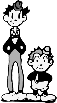
Tom and Jerry. Just, you know, not the ones you know: Van Beuren and Paul Terry. We previously met Paul Terry, about whom it’s said his Terrytoons were poorly made, badly received and which are generally seen as being quite unsuccessful. Well Terry worked for Fable Pictures, renamed in 1928 as Van Beuren Pictures after its new owner, but left a year after the takeover to pursue his somewhat doomed own venture. In the meantime, Van Beuren Pictures released a series about two mismatched men who went under the names of, yes you guessed it, Tom and Jerry. This was, to be fair, over a decade before the world’s favourite cat and mouse team would appear on our screens, and while I won’t accuse MGM of robbing the name, what is certain is that if, even today, the names are mentioned it’s always the cat and mouse who come to mind. Be that as it may, back in 1931 Van Beuren unleashed his Tom and Jerry on the world, and if they’re memorable for anything it’s for the talents of one Joseph Barbera who worked on the series, and who would later team up with William Hanna to create a legendary animation team which brought us, amongst others, The Flintstones and Top Cat. Reading further now (always a good idea before writing, something I never do) I see that the pair actually invented Tom and Jerry - the famous ones - when they moved to MGM in 1940. So the name is not coincidentally the same, it’s deliberate, and you’d wonder how they were able to copy it. Sure, the names are common enough, but in the same team of cartoon characters? Van Beuren must have been fuming. Anyway, what were they like? Well according to Wiki they were of the old style (though in colour, presumably two-strip as our man Walt was holding on to three-strip like a man trying desperately to retain his grip on the winning lottery ticket) and utilised little speech, mostly conveying their intentions through the medium of music. Tom and Jerry (these ones) were a sort of tramp duo, perhaps something similar to Mutt and Jeff, and one was very tall while the other was very short. My intention is to check out, if I can, three of the movies, beginning with the first ever, 1931’s Wot a Night (for you Americans, that’s a colloquial English way of saying what a night). Oh. So not in colour then, at least not this first one. All right. Well in this one they appear to be taxi drivers, and the cab also has a face, sneezing in the driving rain, the wind so strong it literally uplifts everything including buildings, and makes it seem as if they’re going to blow away. They don’t, but the effect is good. The idea of cars and other objects having faces and making expressions, even speaking, once sound came properly to cartoons, would become another thing cartoons did, and we saw be used by George Moreno at the tail end of the 1940s, with his cartoon, also about a taxi, called Bubble and Squeak. There are some clever ideas here. Although the train follows the Disney standard of seeming to dance along the tracks, when the rail is flooded oars come out of the carriages, and when the passengers, having alighted from the train and been picked up by our heroes, end up going underwater again in the heavy rain, there’s a boat lowered from the cab to save them and bring them back on board. Realism pops its head in when the passengers then calmly leg it without paying their fare, and when Tom and Jerry pursue them towards a castle (rich bastards huh? And let’s be honest here: they’re made very much to look like Jews) a portcullis slams down and traps them in the courtyard. A stormcloud comes along and starts playing the battlements of the castle like the keys of a piano (again with the piano!) and our heroes have no choice but to venture inside the castle in search of their fare. It seems to be some sort of ghost castle, as it’s people with some weird flying bird with bat wings, skeletons and, oh yeah, ghosts. Good usage of the screw principle, which is to say, one skeleton, when he sees Tom and Jerry, is so scared he screws himself right down into the plughole of the bath he’s been washing himself in, while another, creating a piano (yeah I know) by basically painting it screws himself down when the piano stool is too short. Oh, and there are black skeletons too. And then Tom and Jerry are turned into skeletons. Guess they never get their money then. Meh, emphasis on the clever animation and the sounds, but you’d have to say nothing Disney and others had not done previously. Most importantly, to me, the story makes no sense. I know it’s a cartoon but still: who were the “Jews”? Why did they not pay, and why, in the name of sanity, did they turn Tom and Jerry into skeletons? Very weird, and really not very satisfying. Let’s see if they improved. That was 1931. How were they a year later? We’re back with pianos, but then, what would you expect in a short entitled The Piano Tooners? Note the pun on the word tuner/toon duh. Plenty of Mickey-like mice here, and I wonder who had the idea first of the ambulance coming for a fallen comrade, Van Beuren or Iwerks? Both cartoons came out in 1932, but whose was released first in the year? Looks like this was second, as it’s November before it’s out, so unless our man Ub released his Flip the Frog cartoon The Milkman in December then he would have had the idea first. Were his shown in cinemas? It looks as if they were. But I wonder would there have been time, between the showing of The Milkman and the release of Piano Tooners to incorporate, i.e., steal the idea of the first-aid thing? Maybe it’s just a coincidence. In any case, they do it better here, with a small ambulance complete with siren coming to take away a stricken mouse. And again we see a form of violence used - although cartoons, particularly Looney Tunes, would become all but synonymous with violence, it’s still odd to see it in the staid and button-down world of 1930s America - when an errant note in the piano is caught, and, well, killed and flushed down the toilet. The fact that it’s made look so cute and innocent, for me, makes this even more disturbing. I know: I need to get out more. Or at all. There’s a seemingly unnecessary joke about a fat woman - a very fat woman - coming in and displacing all the guests at a concert, then some more risque stuff as we see the pianist get dressed and in rather revealing lingerie, caught on stage as the curtain raises prematurely, still trying to fasten her suspender belt (garter, to you). All a little chauvinistic, if not actually misogynist. Yeah, for a kid’s cartoon there’s a whole lot of leg and ample cleavage on show. Hmm. Tom and Jerry only ran for three years, so their final adventure comes in summer 1933, and perhaps attempting to cash in on the science fiction serials such as Flash Gordon and Commander Cody which were popular around this time, The Phantom Rocket features the pair being launched into space. Tying in too with growing practice of cartoons to tend towards mischief and mayhem, the rocket is hijacked by a desperado and, well, pretty much kills everyone, wrecking a ferris wheel, pulling up telephone lines and eventually diving underwater. This gives the animators plenty to do, with various fish and even mermaids coming out of a shipwreck in a state of undress, followed quickly by divers hastily putting their helmets back on, so again more sexual innuendo that the kids would of course not have got but the adults may have. It ends up crashing - into the local jail, where Tom and Jerry are rewarded, and so their final cartoon ends up making them rich, a good reason to stop getting into all sorts of scrapes and capers, and settle down somewhere. With the exit of Tom and Jerry, Van Beuren went on to produce a series of animated shorts called Rainbow Parade between 1934 and 1936. The first of these, Pastry Town Wedding, was in the drab old two-strip Technicolor (Disney’s hold on three-strip wouldn’t expire for another two years) but looks a lot better than the Tom and Jerry cartoons. Yes, those are in black-and-white, or at least the ones I can find are, but overall the animation here is better. Again it’s based on musical performance and like the final Tom and Jerry above, looks to have had this song written for it perhaps; it’s quite clever, almost giving me a sense of The Nightmare Before Christmas in terms of the song. I must say, the head baker, who we see first, looks quite evil for some reason. Maybe it’s the curled moustache or the thick eyebrows. Sound/speech sync is not too bad. It’s clever, and the ideas are well thought-out, but you can see where it would have benefit from three-strip if only Walt hadn’t been such a greedy fucker. The first of the Rainbow Parade cartoons to use three-strip then was Molly Moo-Cow and the Butterflies (1935), and immediately you can see the difference. The colours are brighter, deeper, more alive. And of course, there are more of them. I guess in such a circumstance, as they change over from two to three-strip Technicolor, butterflies was a good choice to display the expanded use of colour, and it works well. No speech in this one; they seem to be relying on showing off their new colours and do so through the medium of music and dance. I would point out that Molly Moo Cow bears more than a passing resemblance to Ub Iwerks’s Clara Cowbelle. Oh I’m wrong: now there is speech, as a butterfly collector enters the scene and captures all Molly’s friends, then for some reason begins singing about how he loves catching butterflies, as Molly tries to come up with a plan to release the insects and set them free. She eventually hits upon the idea of disguising herself as a butterfly and so… well, it’s a silly story but what the hell. Nobody ever said cartoons had to make sense, and to be honest, if there’s one thing I’ve learned writing and researching the history of animation it’s that it’s damned hard work. But if there’s another thing I’ve learned it’s that it is totally futile and a waste of energy to try to ascribe logic to cartoons. So the fact that a professional lepidopterist would easily - as would anyone else - see through such a disguise, or that his net is way too small to capture this huge “butterfly”, to say nothing of the fact that cows can’t fly, is all beside the point. It’s a cool and not terribly funny but clever cartoon. Let’s check out one more. This is the first of several that featured my little pal Felix the Cat (Van Beuren must have had some deal going with to use him) and it’s interesting for several reasons. It’s the first time, I think, that I’ve come across a cartoon using someone else’s creation, not to mention that it’s the first time I’ve seen Felix in colour (though of course he remains black) and also heard him speak. In Felix and the Goose that Laid the Golden Egg, they’re obviously plundering the tale of Jack and the Beanstalk, bringing two well-loved characters, if you will, from folklore together, and though I’m not familiar with this series (Rainbow Parade) or indeed Felix’s own adventures, this also seems to feature his arch enemy, Captain Kidd? The idea is that Felix is using the Goose to give out aid to the needy from what is termed the “Relief Office”, but Captain Kidd wants the goose for himself of course. Felix recognises him, disguised as an old woman, and a chase ensues. Good to see that Felix retains his zany cartoon logic, turning himself into a cannonball and firing himself at the pirate ship when Kidd makes off with the goose and sails away. Interesting to hear Kidd say to Felix “Why you little..” sixty years before it would become one of Homer Simpson’s catchphrases. Felix of course saves the day and showers the town in gold fired from the ship’s cannon, thus completely screwing up the town’s economy, but that’s cartoons for ya! Looks like Rainbow Parade were Van Beuren’s last ventures in animation; RKO, their distributor for the series, went with Disney instead, and after 1936 they diversified into live-action and adverts, with founder Amadee J. Van Beuren actually dying two years later of a heart attack. I suppose, if you were very cruel and unfair, you could suggest that Disney literally killed his competition.
__________________
Trollheart: Signature-free since April 2018 |
08-06-2022, 10:42 AM | #64 (permalink) |
Born to be mild
Join Date: Oct 2008
Location: 404 Not Found
Posts: 26,992
|
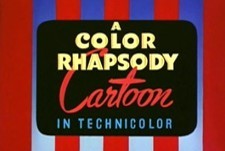
We have to give a shout-out to Charles Mintz, whose company Screen Gems produced the Colour Rhapsody series from 1934 all the way up to 1949. Notably, other than Disney this seems to have been the first animation studio to be nominated for an Academy Award (though I guess it didn’t win, as it’s only shown as nominee), and throughout its run, though it would never win any, it was nominated for a further four. Very impressive. Our man Ub Iwerks was on their staff for a time, and in fact it was Mintz who, when working at Winkler Pictures (which he owned, after marrying its founder, Katherine Winkler) both greenlit the creation of Oswald the Lucky Rabbit and later stole all the animators working on the cartoon when Disney and Iwerks refused to cut costs, and started up his own studio. Perhaps in a move of poetic justice, Oswald was then taken by Universal and given to their in-house animator, Charles Lantz, but Mintz continued on without him and decided to concentrate on a sort of mash-up of Felix the Cat and Mickey Mouse called Krazy Kat. To properly check this little guy out we have to emulate Felix and push the timeline back momentarily, and as the clock hands spin in reverse around the dial and the little black-and-white feline strains against an imaginary line, forcing it backwards, we arrive in 1913, when most animators around the world are still struggling with how to make simple drawings move on paper. Not so George Herriman, for such was, initially, not his interest. His character, the aforementioned Krazy Kat, was perfectly happy living as a two-dimensional occupant of a newspaper strip, and would not see film animation for another twenty years. In point of fact, he goes back further than that, three years in fact, to 1910, as Krazy Kat was a spin-off character (the first in comic strip history? A subject for a journal on comics, should anyone undertake one - oh look! I’m doing that!) from a previous strip, The Dingbat Family. In a very offbeat treatment of the cat/mouse dynamic, Krazy was in fact in love with the mouse, Ignatz, though the feeling was most certainly not mutual, the mouse reciprocating by way of hurling bricks at the cat. I couldn’t say that’s the first instance of violence in a cartoon strip - it most certainly is not; see The Return of John Bull in my Childhood Heroes: A Comic History journal - but it may be the first instance of one anthro inflicting violence on another. A lot of interesting stuff for me to dissect when the time comes for me to feature this in the other journal, but right now we’re concerned with the animated version of Krazy Kat, so we’ll leave all the philosophical stuff, the differently-sized and arranged panels, the odd landscapes and the frankly flowery dialogue for another time. It must be pointed out that just as Disney had the protection (exclusive contract) of Technicolor for the three-strip colour cartoons, and as, in another journal, I explain Pan American Airlines were shielded by the US Government from competition in their formative years, Herriman had his own champion in the titanic figure of newspaper magnate William Randolph Hearst (the figure, of course, on whom Charles Foster Kane is based in Welles’ iconic movie), who loved Krazy Kat so much that he rejected criticism of the strip, even though most seemed to believe it too highbrow and not slapstick enough, and even arranged for Krazy Kat’s first transition to the screen in a black-and-white silent in 1916. Actually, it’s the seventh, now that I check, but it’s the earliest I can get a video for. Beaten to it only a year before by Raoul Barré with The Animated Grouch Chasers, Herriman here uses circling stars when Krazy crashes his bike, plus lines of sight when he looks at something. Though in fairness, Barré’s effort was mostly live-action, and this is a full cartoon, if an early one, so maybe the process could be credited to Herriman. Oh well maybe not; seems he wasn’t involved in the film versions. Doesn’t say who was. A pity, as it does seem a pioneering effect that would be used until sound/speech came into more common use a decade or two later. The cartoon isn’t much to write home about (you can see it above) - the light has that sort of bulb-about-to-blow feel of coming and going, the story is all but negligible, the relationship between Ignatz and Krazy is ignored (both seem good friends - also both appear male) and not a single brick is thrown, the hallmark of the newspaper strip. Nothing much happens either, but to be fair, the animation is fluid and doesn’t jerk or jump, and the speech balloons work well in the place of actual spoken dialogue so you can tell what’s going on: so much better and more personal, I feel, than cutting to a title card every time someone says something. For the time it’s pretty impressive really, and points the way towards the direction animation would take. The first Krazy Kat short made by the John Randolph Bray studio (we learned about him before) came out in 1920, so let’s have a look and see if there is any major difference. Obviously, we’re still talking black and white here, and probably silent I would say, but four years on, has the animation improved, has the story become any more engaging? Well I would say the music is worse, a lot more tinny sounding and quite warped (admittedly this is 1920 but still, the 1916 one sounded smooth and clear) and to be honest, the animation has not improved much. Now Bray is using those damned title cards, which annoys me, and Krazy looks less like a cat than he did in Bugologist: more like a dog really. As an aside, I’ve always wondered where the myth began that mice eat cheese? They don’t, but the lie has been perpetrated down through animation and mice eating, or stealing, or wanting cheese has become a staple of cartoons. I will give Bray this much, that when Ignatz tries to stomp a huge wheel of cheese into his impossibly tiny bag, a face appears on it as if it’s grimacing. But again, meh, it’s nothing great overall. The last Bray animation of Krazy Kat was only a year later, but I can’t comment on the soundtrack as some idiot has clearly added his own modern one. The animation overall is still what I would call poor. Yes, it’s 1921 but still, this is weak. Bray uses what would become a tried-and-tested method of time saving (and cost saving) by drawing a crowd but repeating the same figures several times to make it look like there are more there than there actually are. This would be done later with backgrounds too, especially houses and streets. Hmm. He seems to use the occasional speech balloon (square ones, well, rectangular ones) but mostly relies on title cards. Also, again, the relationship between the two is far friendlier than it should be; there's no sign of the conflict prevalent when one person is in love and the other is not. Again, no bricks. Usage of exclamation marks (points) and question marks too. Overall again I’d have to say a poor effort. This is where Charles Mintz comes back into the picture, as he lost Oswald and pinned his animation future on Krazy Kat. However, frustratingly, I can find no early Winkler Pictures cartoons on YouTube, (not that many Krazy Kat at all really) and so the first time we see what Mintz’s animators were doing with him is as the timeline snaps back like an overstretched elastic band and Felix is cat-apulted (sorry) all the way to our present timeline, to 1932, where we find Seeing Stars (1932). Well by now the little guy has undergone a major makeover, which really can be called more a, what would we call it? Cloning? Basically he’s now very like Felix with a dash of Mickey, and essentially any originality he had, any identity has been thrown away in the desperate attempt by Mintz to be like the Disney character who was taking America by storm, and soon to do the same worldwide. He even dances, where before he did not. And there are some very Mickey-looking Ignatzes (well, mice anyway - I don’t know if Ignatz has even been retained at this stage) lifting - oh dear god help us! Another fucking piano! Don’t these cartoon characters know how to play anything else? Stand by for the usual by-now-standard high jinks with the piano, and yes, there are the Marx Brothers emerging from it. Sigh. Didn’t Ub Iwerks already do this with Flip the Frog? More, I assume, famous Hollywood stars of the thirties being caricatured, though I don’t recognise any. Okay, I recognise Laurel and Hardy, and maybe that’s Charlie Chaplin? The point is, the cartoon is pretty bereft of imagination, copying others that have done the same thing, although in fairness this is over ten years down the line since Mintz’s studios took over the character. Still, he hasn’t progressed much, in fact I’d say he’s regressed, till he’s just a poor man’s Felix really. Damned boring if you ask me. I don’t know if the video shown is deteriorating after nearly ninety years, but The Masquerade Party (1934) seems to have a really annoying reddish cast to it While The Trapeze Artist, from the same year, seems to suffer from way too much blue/purple. As does Highway Snobbery from two years later. Basically, I’d have to say that either these films have not been well preserved or that the animation was pretty shit for the time compared to other studios, and I’d have to think it’s the latter. Krazy Kat may have been a big influence on a lot of animators and artists, but mostly I think through the original comic strip, as these cartoons leave very much a lot to be desired. Krazy Kat’s theatrical adventures ended in 1940, though really he looks to have been winding down by 1936/37 and by 1939 he had had at best staggered appearances compared to previous years, with his final appearances being a mere two shorts in 1940. Mintz did not live to see the last films, dying of a heart attack (what is it with all these animators dying of heart attacks?) in 1939. Walt Disney apparently praised him for “high quality cartoons”: I would not agree, based on what I’ve seen here. Before we judge him too harshly though, let’s check out the series that opened this article on him, the Color Rhapsodies, which ran from 1934 to 1949. The first of them, Holiday Land (1934) suffers of course from the lack of three-strip but the animator, Art Davis, does what he can within the limits he’s forced to remain. A lot of blue, red and black, sort of like those old computer games before you upgraded to an EGA card. What the fuck are you talking about, Trollheart? Never mind, never mind. Forget I spoke. I wonder is this the first instance of that old favourite, particularly beloved of the Pink Panther in later years, of waking up and grabbing a hammer to silence the alarm clock? First time I’ve seen it anyway. Some cute ideas. The calendar flipping as important dates are blown off (is this meant to indicate the passage of time, and if so, is this another first? Or is it just the wind blowing the pages off?) and the related figures come out of them and parade around is clever. Father Christmas for December 25, Old Man Time for New Year’s Day, turkeys on Thanksgiving and so on (but do you Americans celebrate Halloween on October 30? It’s the 31st for us, but that calendar page shown is October 30) and I like how the ducks parading for easter drop a small egg and out of it comes duckling, who, seeing he’s being left behind, uses the half-shell as a small boat and rows along behind the others, trying to catch up. The idea, then, seems to be that a lazy child who won’t get up is visited and taken on a tour of all the major holidays by a tiny Father Time, presumably to show him how if he sleeps his life away he will miss all the good things in life? Well, whatever but this is already far better than the Krazy Kat efforts coming out at this time from Mintz’s studios. As I say, these continued almost into the 1950s, but as our timeline here is only concerned with up to 1940, let’s take one from, oh let’s say 1938. By now, Walt had lost his monopoly on three-strip Technicolor, so let’s see what our friend Ub Iwerks did with that while working for Mintz. This is, then, Midnight Frolics (1938) and though - unsurprisingly, given the title - it takes place at night, you can already see the change. The colours are richer, deeper, more resonant. The blues and purples are very deep, the pink is quite rosy. You can almost get a feeling of early Scooby-Doo about this. The transparency of the ghosts is handled well: you actually can see through them, but in a kind of more translucent way. But damn it, eight years on and it’s still bloody musical based! Clever ideas again. I like the ghost salesman who keeps trying to sell the other ghosts things, and it’s interesting to have a cartoon based entirely on ghosts - I mean, there’s a mouse, but for once he’s just an observer, and also a cuckoo in his clock, but the cartoon revolves around the exploits of the ghosts. Yeah, not bad.
__________________
Trollheart: Signature-free since April 2018 |
08-14-2022, 11:34 AM | #65 (permalink) |
Born to be mild
Join Date: Oct 2008
Location: 404 Not Found
Posts: 26,992
|
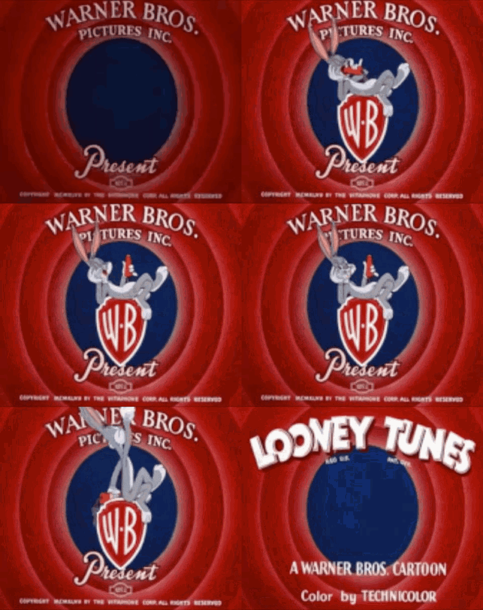
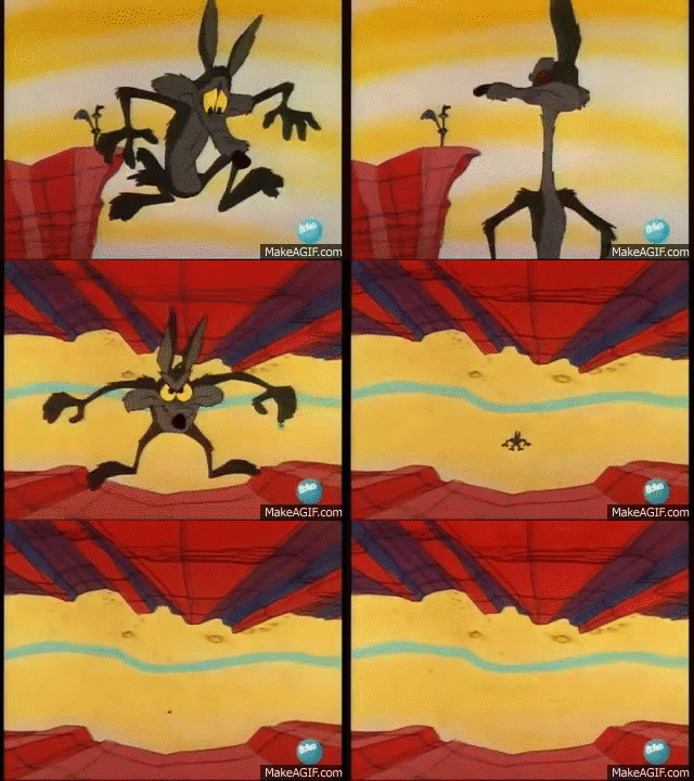
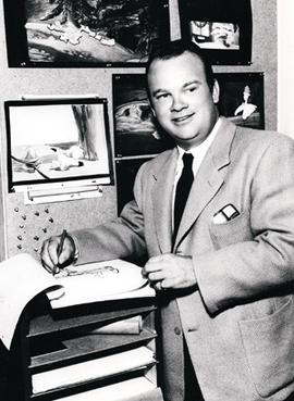
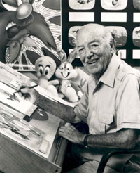
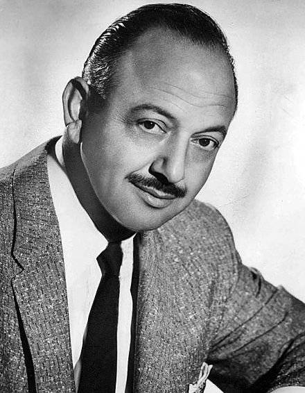
As the new decade bore down upon the world and the dark clouds of war began to gather, though not yet for America, Warner Bros set about mounting a serious challenge to Disney, a task it has to be said they achieved. The creation of the very first Looney Tunes character, Porky Pig, was followed in relatively rapid succession by names which would reverberate down the annals of animation and cartoon history: Elmer Fudd, Daffy Duck, Sylvester and Bugs Bunny. For almost forty years Looney Tunes and its companion series Merrie Melodies would thrill and make children laugh in cinemas, and later on television, and even today these cartoons are still shown and appreciated, as much by the adults who grew up on them as by the kids of today. Some cartoons are timeless, and some subjects are evergreen - one character getting constantly hurt by another, traps, schemes, wacky machines, hunger, chases, territorialism and all the other things that go up to make relationships between cartoon characters kept Looney Tunes and Merrie Melodies fresh, even if in general, the same basic plot was being rehashed each time. Wile E. Coyote employs more and more zany and unreliable methods to catch Roadrunner, methods which invariably fail. Sylvester tries in vain to eat Tweety-Pie. Tom chases Jerry. Bugs outsmarts the hunter, and often Daffy too. Speedy Gonzales is the fastest mouse in the south, and Yosemite Sam is the fastest gun in the West (and also possesses the largest moustache and biggest hat). Foghorn Leghorn cannot convince that kid that he is a sparrowhawk, not a chickenhawk, and Porky still has his endearing stammer. Looney Tunes/Merrie Melodies never really broke with what was a successful formula. If Wile E. Coyote bought something from ACME we knew it would end up turning against him. If Tom caught Jerry we knew the mouse would get away. It wasn’t really new stuff that attracted us, it was the repetition of the old. I mean, who didn’t laugh every time that cloud of dust came up from the desert floor as the luckless coyote impacted it? A real case of, if it ain’t broke don’t fix it. So Warner based their cartoons around the predictable, the expected and the familiar. Not the actual events, but you could tell how things were going to turn out at the end. The animation from the first was better than good, and would of course end up top-class, and unlike Disney, who would, for a long time, stick to having songs in their cartoons, Warner would have incidental music but usually no actual songs, except on odd occasions, like maybe if Bugs serenaded someone or Daffy was in a band or whatever. With Looney Tunes (let’s just assume Merrie Melodies is included in that; I’m tired of writing both) it was all about the zaniness of the cartoon, the illogical universe the characters inhabited, and their personalities. With Disney it was definitely more story-based, as their features tended to plunder old fairy tales - Snow White, Sleeping Beauty, Pinocchio etc - and also literature, as they tacked Alice in Wonderland, Peter Pan and the like. Story before personality, really, though that’s not to say they didn’t imbue their characters with personality. But can you really remember much about the prince in Sleeping Beauty, or Wendy in Peter Pan? Looney Tunes characters would be known for their catchphrases and the things they did. Bugs nibbling a carrot asking “What’s up Doc?” or Daffy telling someone - usually the rabbit - they were despicable. Sylvester would exclaim “Suffering succotash!” (and we all wondered what the hell succotash was, though nobody really cared) and Speedy would cry “Yee hah! Yee Hah! Hondolay!” and streak off. The vast majority of Looney Tunes’ anthros would have no clothes, and yet there was no suggestion of nudity. Foghorn Leghorn, Bugs, Daffy and Sylvester strode around as nature intended, and there were no irate telephone calls to the network. Others were dressed: Speedy wore a sombrero and Spanish garb, Porky wore a tweed suit, Elmer Fudd a hunting outfit, and of course Yosemite Sam was dressed as a cowboy. Often these disparate characters would star in their own cartoon solo, but often too they would meet or be paired up with others, most famously Bugs and Daffy, who seldom got on. Tex Avery (1908 - 1980) One of the most recognisable names in cartoons, and one of those who helped usher in the non-Disney part of the Golden Age of American Cartoons, Frederick Beans “Tex” Avery was of course as you would expect born in Texas, just outside of Austin. From such small acorns… Beginning his career as a lowly inker with Winkler Pictures, he was perhaps privileged to have worked on the early cartoons of Oswald the Lucky Rabbit, but left Winkler to go to Universal Studios, again as an inker initially but soon his talent was recognised and rewarded, and he was the animator who worked on Oswald after production was moved to Universal. He also began his directing career here. An office accident led to his losing the sight in one eye when one of his co-workers shot a paper clip his way via rubber band and, warned by another colleague to look out, he turned at the wrong time and the paper clip hit his eye. In 1935, unhappy with his wages, he began to let his standards slip, hoping to be fired. He was, and then moved to Leon Schlesinger’s studio, where he worked on the Looney Tunes, which were at this time, and until 1940, in black and white still, and also Merrie Melodies, which had been in Technicolor since 1935. Working with other directors, including Jack King and Friz Freleng, Avery had the use of four animators - Chuck Jones, Sid Sutherland, Bob Clampett and Virgil Ross, and they all moved into a new five-room bungalow at Warners when they outgrew the main studio. Due to its dilapidated condition and insect infestation, this became known as “Termite Terrace”. Within his first year at Warners Avery had discounted the character meant to be the main one, Beans the Cat, in favour of Porky Pig, whom he redesigned the next year to be cuter and more cartoon-like. Reportedly a good boss to work for, Avery talked to his animators and often went to the lengths of explaining some of his ideas if they didn’t get them. He was always smiling and pleasant, and often lent his voice to some of the characters. He presided over the creation of Daffy Duck, Elmer Fudd and Bugs Bunny (though he did not like the name, preferring instead Jack E. Rabbit, but was overruled by the studio) and became a household name. In 1941 he left Warners to work at MGM, where he really came into his own, even creating some very risque (for the time) cartoons such as Blitz Wolf, which parodied the Three Little Pigs fairy tale with Adolf Hitler, and Red Hot Riding Hood, which you can probably guess at. All told, he worked at MGM till 1953, with one year off in 1950, the longest he had worked at any studio. Avery later became quite depressed and withdrawn when his son committed suicide, and he moved into television commercial cartoons, but never seemed happy in the medium. He died in 1980 of cancer, remembered as one of the men who made cartoons into what they are today. Friz Freleng (1905 - 1995) Some of the names of animator, directors and producers just stuck in my mind as a kid a) because they were so prominent in the opening credits and b) they were weird to me. Quimby, Avery, and this guy. I always thought it was odd that he wasn’t Fritz Freleng, but Friz. His actual name was Isadore, and he was from the same town which could almost be called Cartoon City, Kansas City in Missouri, from which had already sprung Ub Iwerks, Rudolph Ising, Hugh Harman and Carmen Maxwell. Oh yeah, and some guy called Walt. After he moved to Hollywood, Disney invited the Kansas City mob to join him at his new studio, and Freleng followed the others in 1927. As with so many of Disney’s animators though, Freleng found the way he was treated unconducive to remaining and instead joined Ising and Harman on the Bokso cartoons, but worried these might not be successful he headed to New York where he worked on Krazy Kat for Charles Mintz. He returned to take up a position as director for Leon Schlesinger on the Looney Tunes, and was instrumental in bringing Porky Pig to life. He had a short spell with MGM but returned to Warners in 1939. He was heavily involved in the development of Sylvester and Tweety Pie, Yosemite Sam and Speedy Gonzales. During his time he won four Academy Awards and was nominated for six more. Later he would move to Hanna-Barbera and with David DePatie create the iconic Pink Panther, among others. He died in 1995, perhaps one of the few animators not to die of cancer, but of natural causes. He was 89 years old. Bob Clampett (1913 - 1984) Perhaps a less well-known name, maybe because he only remained in cartoons till 1945, Bob Clampett nevertheless was important to the creation and development of some of Warners Looney Tunes best-known characters, such as Sylvester and Tweety, Porky Pig and Daffy Duck. One of the only animators to be born in California, and perhaps one of the only Irish-American ones, his parents being immigrants from County Tipperary, Clampett lived next door to Charlie Chaplin and knew Harold Lloyd, and was a child prodigy, already excellent at art by age five. He was involved with Walt Disney when, on the basis of a sketch he made at the cinema, his aunt created a line of Mickey Mouse dolls to sell, with Disney’s approval. At age seventeen, Clampett joined Ising and Harman on Schlesinger’s Merry Melodies, and worked under Friz Freleng, who took him under his wing. In 1934 he submitted a drawing of a pig to Schlesinger, who was looking for a new character, and so Porky Pig was born. Later he moved into the infamous “Termite Terrace” under Tex Avery and worked with his animators, and in 1937 when Avery created Daffy Duck it was Clampett who animated him. Clampett was largely responsible for the increasingly surreal universe the Looney Tunes characters inhabited, as he threw the rule book out the window. After setting fire to it. His style went down so well at cinemas that Schlesinger instructed his other animators to follow suit, leading to Warners becoming the standard for crazy, zany, off-the-charts cartoons, with things like characters running off the page, being rubbed out, finding themselves in black or white nothingness, and on more than one occasion, directly addressing the animator. Roadrunner’s weird non-logic world came from this idea too, the likes of train tunnels drawn on walls by Wile E. Coyote becoming passable for Roadrunner but not for him. Clampett left Warners in 1946 and though he worked for a short time for Charles Mintz’s Screen Gems, he soon turned his attention to puppets, which would win him three Emmys for the show Time for Beany, and then took to the lecture circuit, sharing his experience and expertise with college students and would-be animators. He died in 1984 of a heart attack. His genius may have come at a price though; his colleagues did not have much good to say about him, some of them claiming he took credit for their ideas, others annoyed at the way he and only he seemed able to break the rules at Warner. He is on record claiming creation of both Bugs Bunny and Yosemite Sam, and Daffy Duck. I suppose it depends on who you decide to believe; a friend of Clampett’s maintains it was all a smear campaign by Chuck Jones, who didn’t like Clampett. Chuck Jones (1912 - 2002) Another name we would see in my day written large at the start of our favourite cartoons, Chuck Jones was another Warners animator, who could be said to have inherited his artistic ability from his father, though not really. Charles Adam Jones was no artist, but a businessman, however he supplied his children regularly with previously-imprinted stationery as each venture failed, giving them all an interest in drawing. Chuck worked first for Ub Iwerks as a cel washer, then a painter, and so on up the ladder until he was taken on as an assistant animator by Leon Schlesinger on the closure of Iwerks’s studio in 1933. Two years later he was promoted to assistant animator and moved into “Termite Terrace” along with Tex Avery, Sid Sutherland, Virgil Ross and Bob Clampett. Truth to tell, Jones did not get on well at Schlesinger’s studio, patterning his creations more on the Disney principle and being seen as “just not funny”. Schlesinger did in fact want to fire him but could not find a replacement; his involvement in attempting to unionise the studio would not have done much to mollify his boss either. The two butted heads and this led to a short strike at the studio, led by Jones, and in turn leading to the reluctant acceptance of defeat by Schelesinger as the union was established at his studio. During World War II Jones worked with Dr. Seuss, otherwise known as Theodor Geisel, on army educational cartoons called the Private Snafu series. He would work with him again after the war, particularly on How the Grinch Stole Christmas in 1966. During the short closure of Warners in 1953 he moved to Disney, where he worked on the feature film Sleeping Beauty, though he received no credit for his work, then rejoined Warner when they reopened. There, his most famous creations were Pepe Le Pew, Marvin the Martian and the iconic Wile E. Coyote and RoadRunner. In 1963, when Warners closed down for good, he set up his own studio but this was quickly (within a year) taken over by MGM, and he found himself working on “sanitising” (removing the content seen as objectionable, read, racist) the theatrical Tom and Jerry cartoons for distribution to the new television medium. In 1975 he wrote to Tex Avery, accusing Bob Clampett of stealing his ideas and those of other animators, and taking credit for work that was not his. Jones was nominated for two Academy Awards and won two more, including an honorary Lifetime Achievement Award, for "the creation of classic cartoons and cartoon characters whose animated lives have brought joy to our real ones for more than half a century." He died in 2002 of heart failure. Mel Blanc (1908 - 1989) Quite rightly called “the man of a thousand voices”, Mel Blanc was the one who brought our favourite cartoon characters to life by giving them a voice. Chuck Jones, Tex Avery, Bob Clampett and the rest could draw them and direct them, but they were silent until Blanc spoke for them. His most famous voice is of course that of the wisecracking rabbit Bugs Bunny, but in his time he also voiced Daffy Duck, Porky Pig, Barney Rubble, Speedy Gonzales, Elmer Fudd, Pepe Le Pew, Yosemite Sam, Marvin the Martian, Tweety Pie, Sylvester, Foghorn Leghorn, Secret Squirrel, Captain Caveman and many others too numerous to list in this short article. Always interested in utilising his voice, and changing his name from its original Blank to Blanc because a teacher had told him rather callously that his surname was appropriate, as he would amount to nothing, Blanc first worked on radio, starting at age 19 and finding a place on the popular Jack Benny Program in 1935, remaining a regular on the show until it ended twenty years later. His popularity on the show led to him having one of his own, which ran for a year up to 1947. It was however with Warner Bros - originally Leon Schlesinger’s studio - that he found his greatest fame, voicing most of the cartoon characters being created there, as detailed above. Soon he was one of the most recognisable voices in America, and indeed the world. He also worked with Chuck Jones and Dr. Seuss during the war, creating the voice for the hapless Private Snafu. Later in his career he would go on to provide voices for characters for the Hanna-Barbera Studio, including Wally Gator and Barney Rubble, and in 1961 he was involved in a serious car accident, only reached in the coma into which he had fallen by the doctors addressing not him, but his cartoon characters. He in fact provided the voice for Barney for many episodes of The Flintstones from hospital, lying on his back with the other cast members gathered around his bed. He set up his own production company and, like Clampett, got on the college lecture circuit. Mel Blanc died in 1989 from complications brought on by emphysema, and coronary artery disease. He has a star on the Hollywood Walk of Fame as does Bugs Bunny, his most famous voice. His headstone, at his request, contains the epitaph “That’s all folks!”
__________________
Trollheart: Signature-free since April 2018 |
08-20-2024, 10:42 AM | #66 (permalink) |
Born to be mild
Join Date: Oct 2008
Location: 404 Not Found
Posts: 26,992
|
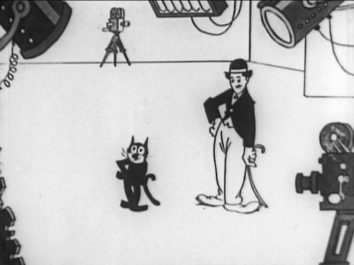
Right. Who am I, you ask, possibly squinting into a monocle as you sip your champagne, to decide what are the fifty greatest cartoons ever made? I’m nobody, is the answer, and I wouldn’t have the audacity to make such a claim. No, this list was compiled by over a thousand animators, cartoon historians and animation professionals, according to Jerry Beck, editor of The Fifty Greatest Cartoons, as Selected by 1000 Animation Professionals. And surely they know their stuff? So we’re going to do a countdown here, looking into each of these and if I can get a video for them I’ll display that here too, though who knows? Some of these may be too old, rare or just out of circulation. But we’ll see. Either way, we’ll obviously be going backwards, counting down to the top cartoon ever. And we begin, of course, with number Title: “Felix in Hollywood” Year released: 1923 Character(s): Felix the Cat Story by: Otto Messmer Animation by: Otto Messmer/Bill Nolan Directed by: Otto Messmer Studio: Margaret J. Winkler Studios We have of course seen this before, in my article about the feisty little feline who became the world’s first cartoon character to kickstart a merchandising line, and whose image was even immortalised on aircraft and tanks during World War II. It’s quite long for the time period, almost feature length really at almost nine and a half minutes, and of course it’s silent, as sound had not yet come to cartoons at this time. But in the typically innovative way animators had of overcoming this - on the surface huge - shortcoming, Felix is able to talk via not only crude speech balloons but also his incredible expressive face and the actions he undertakes. As the cartoon opens, Felix’s owner, a ham actor in every sense, bewails the fact that he must “sacrifice his art and go into movies” (as if this is a foregone conclusion; how many aspiring actors turn up at Hollywood expecting to write their names into history, only to end up bussing tables and desperately trying to catch the eye of a director?) and sends Felix out to get them transport. Evidence of his overindulgent acting is provided when he tells Felix, verbatim, “Go ye forth and procure the wherewithal for sustenance and* transportation to Hollywood!” Right. So off Felix goes forth, and asks himself - and the audience - how he, a cat, is supposed to get money?* But by now we all know Felix is a resourceful kitty, and he comes across a guy closing down his shoe shop, goes to him and says he can make it profitable. If he does, the owner promises, he’ll pay Felix 500 dollars. That should get them to Hollywood! So Felix goes into action. Getting some chewing gum he makes sure it is spread all over town, and as people get stuck in it and have to leave the shoes behind, they all head for the shoe store, which quickly sells out, as Felix promised it would. So he pays Felix and they’re on their way. Except, not quite. The owner has no intention of taking his cat with him, so Felix has to bend the rules of logic as only he can, first replacing his owner’s umbrella, but that doesn’t work, so then he takes the place of his bag, and they’re both off to Hollywood. As soon as they arrive, Felix ditches his nasty owner and heads off to make a career in the movies. He comes unstuck though when, while demonstrating his talents to “the boss” at Static Studios, he does a Charlie Chaplin impression, calling it original, and is admonished by the little tramp himself for stealing his stuff. This is an allusion to the belief that Mesmer created Felix and based him on the movements of the great silent actor. Chased out of the studio, Felix ends up answering a call for help from Douglas Fairbanks (it says here; I wouldn’t know him - not that old!) who is being attacked by wasps. He grabs a gun from a passing cowboy and shoots two of them but then runs out of bullets. Using the cartoon logic again, he has the last one shoot its stinger at him, grabs it, uses it as a sword and defeats the last wasp. The whole thing turns out to have been a movie, and Cecil B. De Mille, impressed with Felix’s acting, offers him a contract. The little guy has made it in Tinseltown. Comments: Although I’m glad to see Felix in the countdown (this is is only entry in it; whether they restricted it to one per character or not I don’t know) I’m a little sad to see him so low down on it, right at the very bottom. Still, given that it is a silent one and so early I suppose you can’t expect the black-and-white wonder cat to be measuring up to the likes of Road Runner, The Flintstones or Mickey Mouse. As a story I find this well written, for what it is. It’s obviously meant mostly to showcase Felix’s ingenuity, from the sticking of gum on the road to impersonating his owner’s bag, right up to using the stinger as a sword, and in ways it presages Felix’s actual debut in Hollywood for real, when he would become one of the most popular and famous cartoon characters on the screen. The usage of speech balloons, though not at that time new, is still well handled, and there’s a kind of villain in the unpleasant owner, who vanishes from the story once the two arrive in Hollywood. The usage of caricatures of famous film stars and directors (apparently) is clever too, and anchors the cartoon to the experiences of movie-goers at the time, who no doubt would have recognised them all. There’s a happy ending, and it’s the happier in that Felix believes at this point his chance in movies is gone, and rescues Fairbanks not to impress anyone, but as a simply altruistic act, which ends up working out for him in ways he could not have expected. The animation is good: Felix both walks upright as an anthro and on all fours like a cat, switching fluidly between both, making sure we never forget he is a cat, and the likes of sight-lines, question marks and the usage of his tail and body as other objects is a real trademark of what Felix had become known for, and would continue to do, as his popularity grew through the next few decades. Apart from all that, other than a slight shake at the beginning of the movie, for something produced almost a hundred years ago as I write (!) this cartoon is remarkably steady and clear, with no signs of deterioration. It doesn’t say it’s been restored or anything, so I have to assume this is how it was when drawn and animated in 1923. My own personal rating: 8/10 taking everything into account: the age, the minimal techniques and technology available, the plot, the animation, the jokes.
__________________
Trollheart: Signature-free since April 2018 |
08-20-2024, 10:43 AM | #67 (permalink) |
Born to be mild
Join Date: Oct 2008
Location: 404 Not Found
Posts: 26,992
|
Title: “The Dover Boys at Pimento University” or “The Rivals of Roquefort Hall” Character(s): The Dover Boys Story by: Tedd Pierce Animation by: Robert Cannon Directed by: Chuck Jones Studio: Warner Bros I have absolutely no doubt that one of the deans of animation, Chuck Jones, will feature in cartoons in much higher positions than this, but for now, this is his first entry, created - rather surprisingly - at a time when the United States was at war. Interestingly, I read that Warners were so disappointed with the cartoon that they tried to fire Jones, but due to a shortage of animators during the war, they had to keep him on. Jones himself says in the book, “They hated it, and if they hadn’t been block-booking theaters they would have withheld it and thrown me out.” The cartoon is, apparently, a parody of an early twentieth-century boys’ book series, The Rover Boys, but neither you nor I, I suspect, care about that. As they say, roll the clip! Like most of the Merry Melodies cartoons even later, there’s a lot of music in this, and it focuses on the rivalry between American universities, with such phrases as “A pox on Yale“ and so on. For absolutely no reason at all, some old guy drifts across the screen, looking like nothing more than a duck with a human head really, and the narrator seems annoyed, clearing his throat after the unexpected interruption and continuing. The scenery, from what I can see, is static, as in, nothing moves and it just seems to be painted, but then, this is 1942 and I imagine that resources were scarce, and this does precede the true start of the Golden Age of American Animation. Chuck Jones is credited as “Charles M. Jones” here. The animation is, to be fair, crude. Characters appear and vanish, and when the love interest, Dora Standpipe comes into the story, she appears out of the window of her house like a cuckoo in a clock (indeed reinforcing this image by calling “Yoo-hoo! Yoo-hoo!”) and then seems to have no legs or feet and rolls along like a sort of bowling pin on wheels. Shades of far, far later South Park and how their characters would move. Animation historians point to this being one of the first cartoons to use more exaggerated characterisation - up to now, they say, animators had tried to make their figures more realistic - but this belies the work of, as already written of, Max Fleischer and even Paul Terry, so I’m not sure where that’s coming from. Then again, who am I to argue with animation historians? Those guys can drop a piano or an anvil on you, stretch you to twice your length or concertina you to a few inches, and go home to their loving families without a second thought. Don’t **** with animation historians! The exaggeration is clearly seen, at any rate, in the way Tom, the lead “hero”, rides his bicycle (sitting on the saddle and tipping back, causing the bike to raise its front wheel up, sort of like he’s popping a wheelie) and in Dick, the middle guy, who is very small (and almost looks like something out of Sherlock Holmes) riding a very big Penny Farthing. None of the three seem to have to touch the handlebars of their bikes, leaning back and looking to me as if the things drive themselves. Nor do the wheels on any of them have spokes. The villain, Dan Backslide, couldn’t look more evil if they had tried: he has green skin, his hair pointed up at the ends to resemble devil’s horns, and his nose is long and thick, perhaps (although maybe I’m being unfair) meant to lend him a Jewish aspect? As he smokes it forms into words, and rather interestingly to me, he uses a phrase we would later hear from Dick Dastardly: “Drat! And double drat!” In another example of animation logic, he takes from under his jacket an absolutely huge locket that could not possibly fit there, and displays it, showing it to be his love, Dora Standpipe. There’s also a very clear attempt at a moral message as the Dover Boys contemptuously pass the saloon in which Dan Backslide plays pool and drinks; the superior attitude makes me want to puke. But then, I don’t know if these Rover Boys books preached this message too - probably did - and therefore maybe Pierce, as the writer, is just referring back to that. Anyway, the three, now four with the addition of Dora, go to play a wholesome game of hide and seek, though for some reason she counts to 100 in increments of five - 30, 35, 40, 45 etc - and the very annoying narrator* calls it hide, go and seek. As they look for places to hide (and Dora seems to be counting to 1000) they end up running out of the park they’re in and through the streets of the city, and then, for no real reason, decide to hide in the saloon, where of course they come face to face with dastardly Dan Backside sorry Backslide. So off he goes and steals a car (which just happens to be the same colour as his suit, purple, and which I assumed was his, but no, he says “A runabout! I’ll steal it! No-one will ever know!”) and kidnaps Dora, tree and all (she’s still ****ing counting and has reached 1200) and off they go, she still facing the tree and apparently unaware that she has been transplanted (sorry) and is now in Backslide’s car. To use the vernacular of the time, Is she one dumb broad or what? Much dumber, of course, are the Dover Boys, who were hiding under the pool table, where Dan Backslide announced, very loudly (who the hell is he talking to anyway?) that he realised Dora must be alone and unprotected, and yet there they stayed. Idiots. Perhaps realising that he can’t actually drive around with a ****ing tree in his car, our Dan consults a handy book of useful facts, and pries her loose (yes, it contains an entry on How best to remove a young lady from a tree!) and when she finally reaches the end of her count (1500) she also finally realises she’s been kidnapped. Now, for some reason as they pass the saloon where the Dover Boys are hiding, she screams “Help!” in a very Olive Oyl way, and Dan ****ing reverses back to the saloon, in case the boys didn’t hear! Stupidity is a common theme in this cartoon, I must say! And if I see that ****ing **** of an old-timer going by for absolutely no discernible reason to the poxy tune of “While Strolling Through the Park One Day” or whatever the Christ**** **** it’s called, I’m going to kill someone! What is the ****ing point? Sorry. Calmed down now. But that’s three times he’s gone by and there has seemed no reason at all for him to be there. I know it’s a cartoon, but come on! At least we now get the familiar chase-along-the-side-of-a-mountain, where the car zooms along precarious mountain roads that perhaps Roadrunner would think twice about traversing, and the Dover Boys go in pursuit. Straining credulity and common sense even more, when Dan throws her into a cottage/hut and locks the doors, she bangs on the door trying to get out, but the ****ing locks are on the inside! Why doesn’t she just try to open them? But no: she’d rather just beat ineffectually on a door which is never going to open to such actions, hoping to attract the attention of the ****ing Dover Boys. I hope Dan ties her to a railroad track, the dumb ****. Now some boy scout happens to be looking in the window (with a telescope, no less) and then goes to send a telegram which the completely clueless Dover Boys are given, still frozen in the pose they were when Dora and Dan drove by. They haven’t done a ****ing thing. They haven’t even moved. Now for some reason each of their bikes has become a unicycle. Sure why not? Before they enter the cottage though, the Dover Boys have to serenade Dora with the college song. They then find Dan inside, battered - Dora can look after herself it seems, even if she is a whinging wagon - and, in quite an ungentlemanly fashion I would have thought, stand him up so they can use him like a punchbag. He doesn’t even resist. In fact, he’s been so kicked about by Dora that he has called for help from the Dover Boys! Talk about hitting a man while he’s down! In the end, and again for no reason I can see, Dora ****s off with the annoying old git, and that’s the end. Comments: I’m not surprised Warners wanted to hand Jones his cards over this. It’s absolutely ****e. I hate it with every fibre of my being. I don’t actually care whether much of the content is based on those books, it’s just total rubbish. The animation is poor, very basic, the narrator pisses me off, Dora pisses me off, the Dover Boys are almost bit-part characters really, and they still piss me off. About the only one who doesn’t piss me off is Dan Backslide. I would say that the face of Tom shows an early version, perhaps, of Fred from Scooby-Doo, but other than that, I see no reason why this should occupy any place on the list. It does so, apparently, for the usage of something called “limited animation”, where, as you might expect, only certain parts of the cartoon move. Mostly it’s static, as I said, and the movements, while sometimes fluid, are in fact too fluid. People seem to roll, just appear or even fly without crossing the intervening spaces. My own personal rating: 3/10. Sorry, I just ****ing hate it.
__________________
Trollheart: Signature-free since April 2018 |
08-20-2024, 10:44 AM | #68 (permalink) |
Born to be mild
Join Date: Oct 2008
Location: 404 Not Found
Posts: 26,992
|
Title: “The Unicorn in the Garden” Year released: 1953 Character(s): Story by: James Thurber Animation by: Phil Monroe/Rudy Larriva/Tom McDonald Directed by: William Hurtz Studio: UPA (United Productions of America) I remember James Thurber. I used to watch My World… and Welcome to It, but I am not really familiar at all with his work. This cartoon is based on his 1939 short story, and is the first entry on the chart, so to speak, for UPA, who would go on to become famous as one of the “second-tier” American animation houses, whose main claim to fame is the short-sighted Mr. Magoo. My first impressions are that the animation is very basic for the time. Given that we’re now twenty years almost past Snow White and the Seven Dwarfs, to say nothing of Popeye and the rise of Warner Bros’ Looney Tunes, this is poor. The colour looks washed-out, like those three-step ones before Uncle Walt’s stranglehold on four-step loosened; it’s almost like a black-and-white cartoon with colour more or less randomly splashed about. The figures are drawn, I suppose, in Thurber’s style, and really are more line drawings than anything else. Kind of reminds me of those early German animations back before the war. To be fair, the animation is smooth enough, even allowing the main character to balance precariously on one foot as he tries to shut the fridge door with the other, weighed down as he is with bottles and things. But the predominant colours used here are white, black, yellow and orange, and it makes it all look very sort of sepia-toned. The run up the flights of stairs is fluid, though in fairness it should be pointed out that this is done in almost darkness, so there’s no real need for much to be drawn in these frames but the man and the stairs, so that might account for the fluidity. At least they use cartoon physics, where, as the man enters his wife’s bedroom (presumably also his, but who knows) his arm elongates to open the shutters on the window, rather than he stand on tiptoes or on a chair. Having seen - and touched - the unicorn that is eating his roses in the garden, he then runs up the stairs to tell his wife, but she, sleepy and grumpy, tells him unicorns don’t exist, and goes back to sleep. She’s made to look very shrewish from the start, even when we hear her sniping voice call down as he drops an egg in the kitchen, and then when we see her, she has dark, slanted eyebrows which show in a frown, sharp eyes and a sharper nose. Doesn’t seem to be much love there. Back he goes anyway to feed the unicorn, delighted it’s still there. Now here they just reuse the entirety of the scene where he ran up the stairs - it’s not a new piece of animation, but the very same one used again. This time his wife threatens to put him in “the booby hatch”, which I assume is an asylum, and goes back to sleep again. When he’s gone back down though, she leaps out of bed and phones the police, saying they’ll need a strait-jacket, and seems very pleased indeed. In the garden, the man finds the unicorn has vanished, though he can see the hoofprints leading into another garden, and sits down under a tree while his wife visits the psychiatrist (very cliched looking - bald head, long beard, Freudesque) and finds herself being the one taken away. Coming to the office, the man is asked by the shrink if he had said he had seen a unicorn, and, presumably seeing his chance to get rid of the wife, says “Of course not: a unicorn is a mythical beast!” And so she’s taken away, to the tunes of the “Wedding March”, no less. The moral at the end is shown as “Don’t count your boobies until they’re hatched.” Clever. Comments: While it’s a cute story, I don’t find the animation great, but let’s see what eminent animation historians have to say about it. In the book. Okay so they tell me that the crude animation was done that way so as to be faithful to Thurber’s own illustrations, and that colour was used very sparingly as the man himself only ever drew line drawings in black. Fair enough. Also, up to this point audiences were used to anthros, and so having human characters (something UPA wanted to stick with, perhaps to distinguish themselves from the madcap antics of Bugs Bunny et al) was seen as “revolutionary” at the time. Well now: wasn’t Snow White human? And Sleeping Beauty? Maybe they mean on television. My own personal rating: 6/10
__________________
Trollheart: Signature-free since April 2018 |
08-20-2024, 10:45 AM | #69 (permalink) |
Born to be mild
Join Date: Oct 2008
Location: 404 Not Found
Posts: 26,992
|
Title: “A Corny Concerto” Year released: 1943 Character(s): Porky Pig, Bugs Bunny, Daffy Duck, Elmer Fudd Story by: Frank Tashlin Animation by: Robert McKimson Directed by: Bob Clampett Studio: Warner Bros The second in the list for Warners, this one features all or most of the main Merrie Melodies cast, and slyly takes a pot-shot at rival Disney’s Fantasia, released three years earlier. It’s the first (in the list) to use the later to be standard idea of making titles alliterative, though this one uses a double-joke, as it were, with the word “corny” being also used to describe the venue, Carnegie Hall, which is changed to, you guessed it, Corny-gie Hall. Naturally, it uses classical music, kicking off with Tchaikovsky’s Piano Concerto No. 1, though this is only heard over the credits. Introducing the whole thing is one of my least favourite Merrie Melodies/Looney Tunes characters, Elmer **** sorry Fudd. His voice - not to mention his lisp - always drove me up the wall, and they use it to the max here, giving him plenty of words with “r” in them. The first sequence is “Tales from the Vienna Woods”, and rather cleverly I guess switches the roles, making Porky Pig the hunter (it’s usually Fudd) as he stalks Bugs Bunny with a dog that looks - I think intentionally - rather a lot like Mickey Mouse’s best friend, Pluto. Nit sure if this is a speechless venture (I don’t say silent, as there is of course music and the introduction by Fudd, who no doubt will be back to annoy us) but Bugs doesn’t speak, merely appearing out of his rabbit hole to show the dog a book of etiquette, in which is written IT AIN’T POLITE TO POINT! After which he slams the book shut on the dog’s nose, then does a sort of ballet dance, taking the opportunity to kick the dog and tie him to a tree. Next they all end up in a bush, and Bugs somehow contrives to fool Porky into thinking he’s the dog, having the pig point the gun at the pointer. Yeah, the usual shenanigans you expect when Bugs Bunny is around. Bugs then manages to get the gun himself and throws in into the bole of a tree, where a rather angry squirrel gets it and shoots all three of them. They stagger around theatrically, dying, then Porky and the dog realise they’re all right, but Bugs is - apparently - done for. As Porky tries to revive him, the rabbit turns into a girl rabbit, slaps him and legs it into the distance. Fudd is back then, as I expected, to introduce the next sequence (wherein for some reason his pants fall down) which is based on The Blue Danube (or to give it its full title, On the Beautiful Blue Danube), featuring a rather well choreographed (this is 1943, remember) waltz by a mother swan and her three cygnets, all going “Quack-quack” in time to the music, and attracting the attention of what must surely be a baby Daffy (Daffy Duckling?) whose raucous QUAKK QUAKK! Does not impress the mother swan. In a kind of retelling then I guess of “The Ugly Ducking”, he’s kicked out of the troupe. Daffy being Daffy though, he doesn’t give up, and when a vulture - in a tuxedo, no less - spies the swans (twisting his eyes like he has a pair of binoculars) it’s up to the plucky little dark duckling to save his new friends. In what would become another cartoon trope, as the vulture prepares to eat the cygnets he sprinkles salt and pepper on them. Daffy, also captured but rejected, for some reason uses an oar to propel himself through the water. When the mother discovers, far too late, that her babies are missing, she goes frantic, and eventually faints, Daffy having to revive her with a bucket of water (!) and then he takes off like a fighter after the vulture. A few things to note here: as he flies, teeth bared (do ducks have teeth?) there is the sound of an aircraft flying and, in cast the audience don’t get it for some reason, he briefly turns into a P-51 Mustang, complete with shark’s teeth painted on. This would, of course, have been a nod to the boys fighting in the Pacific and Europe in the USAF against both the Japanese and the Germans. Two trees, blown together as Daffy passes, huddle together, their branches around each other in fear as they become one tree. Daffy’s fury and speed is such that when he catches up with the vulture he blows the tuxedo off him, leaving him naked but for a bowtie. The little cygnets descend to the lake on tiny parachutes, and in time-honoured fashion, Daffy hounds the vulture to a cloud, where he presents him with a large stick of TNT. In Roadrunner style, the vulture falls from the cloud, is blown to bits and ascends plucking a harp as an angel, while in the next scene we see a grateful mother swan, reunited with her children, has allowed Daffy to join their group as they all sing happily together. Comments: I have to say, I don’t see this as a send-up of Fantasia at all. Other than the fact that you have Elmer Fudd doing a (pretty poor) rip-off of the opening scene (which was originally, I think, live action) it’s really two cartoons, each starring one of the franchise’s biggest stars, and each of these could have been produced as a separate cartoon and not suffered from it. The link, for me, with Elmer Fudd, is superfluous and does not work. That said, there’s a clear wartime message in the second one, with the vulture no doubt being seen as a Nazi and a very young Daffy coming to the rescue as an all-American duck. The choice of music is not surprising: it works well with the swans’ dance, and who after all does not know this piece? Though again, given the subject matter, “Swan Lake” might have worked too. It’s very interesting to see Daffy as a duckling. I don’t know if this was his first appearance - 1943, I would doubt it but let’s see … no, first appeared in 1937. Still, it’s curious to see him so young, and indeed silent, without his trademark catchphrase “You’re despicable!” Of course, Bugs doesn’t get to use his well-known greeting “What’s up Doc?” either, so both are a slight oddity in that regard. Whereas the first short would, I believe, have worked without the Strauss waltz, it is entirely integral to the second, even the bit where it speeds up tying in very well with Daffy’s vengeful attack on the vulture. I mean, it would have worked without the music, but it works better with it. The change of attitude of the mother swan, too, from annoyed at Daffy trying to play with her kids to grateful to him for saving them, and therefore accepting him, is well accomplished within the four minutes or so the cartoon - or this part of it - runs for. Packed quite a lot into such a short space. This I did not know, but I read now that the rejection stamp put upon Daffy by the vulture - “Rejected 4F” - refers to a military rejection for one who is unfit for service, which therefore lends his “fighter aircraft” rescue even more significance. My own personal rating: 8/10
__________________
Trollheart: Signature-free since April 2018 |
08-20-2024, 10:46 AM | #70 (permalink) |
Born to be mild
Join Date: Oct 2008
Location: 404 Not Found
Posts: 26,992
|
Title: “Quasi at the Quackadero” Year released: 1975 Character(s): Quasi, Anita and Rollo Story by: Sally Cruikshank Animation by: Sally Cruikshank Directed by: Sally Cruikshank Studio: None; financed independently The first in many ways. First cartoon on the list to come from the second half of the twentieth century, first to be an independent production, first by a female animator, first to (apparently) be written, animated and directed by the one person. Right, well the intro music is cool, sort of like bluegrass with ducks quacking, but I must admit when we’re introduced to Quasi, who’s supposed to be a duck, he looks more like a frog. His girlfriend (?) Anita has an annoying lisp but the literal looking daggers - where daggers spring from her eyes and shoot at Quasi - is clever. For some reason I don’t understand there’s also a dancing armchair and a rat of some kind in the room. Also a dinosaur rocking horse, which Quasi has a brief ride on. As they wait for him to arrive in a sort of Jetsons-style flying saucer deal, Anita confides to Rollo the robot that she’ll be glad to see the back of him, so is she planning to do away with Quasi, or just break up with him? Whatever is the case, off they go (across a pale pink sky) to the Quackadero, which appears to be some sort of carnival or fairground. The animation puts me in mind a little of Mr. Benn, quite limited for 1975, though I do accept this is an independent venture and Ms. Cruikshank would not have had access to the kind of financial backing larger studios would. This is very ****ing strange and trippy. A barker calls out that he can bring anyone back to a specific moment in their past, and witters on about some vegetable conference, the “victim” saying, as he comes back from the trip, “That never happened to me!” Then there’s “See yourself at every age” in the Hall of Time Mirrors, where Quasi seems to see himself as a series of skeletons, and others for some reason turn into food, “Roll back time”, which the robot uses to watch cities disappear and return to nature, and “Think Blinx - Paints Pictures of* Your Thoughts” which for some reason shows Quasi wanting to eat his two friends. Then there’s “See last night’s dreams'', which goes pretty psychedelic, and I could do without the constant sighs of “Oh!” every few ****ing seconds! Then a guy who looks very much like our Mister Tayto (a mascot for Ireland’s favourite manufacturer of crisps, or as you Americans would say, potato chips) offers Quasi the chance to see how he has been reincarnated over time. Never trust a guy whose head looks like Neil Armstrong has walked there! Of course it’s all a scam - pointless, so far as I can see - and then they’re off to the Time Holes, whatever they may be. This cartoon is giving me a migraine! Well thank Christ it’s nearly over. Anita, true to her word, is about to get rid of Quasi, and with the help of the robot pushes him over the edge, where he falls into the time hole and ends up in the age of dinosaurs. And may he stay there. Comments: I certainly hated that. The animation was okay but the story was impossible to follow, so now I need to read about it to see what those who know about it, well, know about it. Yeah, not much really. Most of it was hand-drawn, so you have to give credit for that, and apparently the reason Anita wanted to get rid of Quasi was that he was rude, but that’s not made in any way clear during the cartoon, unless I suppose you take into account his dream of eating his friends, which they would not have known before going to this odd place. It won awards, but I couldn’t really follow it and I didn’t enjoy it. For an independent production I suppose it’s good, but it’s not for me. My own personal rating: 3/10
__________________
Trollheart: Signature-free since April 2018 |
|