|
Register | Blogging | Today's Posts | Search |
|
Thread Tools | Display Modes |
10-04-2017, 06:57 AM | #52 (permalink) |
one-balled nipple jockey
Join Date: Dec 2010
Location: Dirty Souf Biatch
Posts: 22,006
|
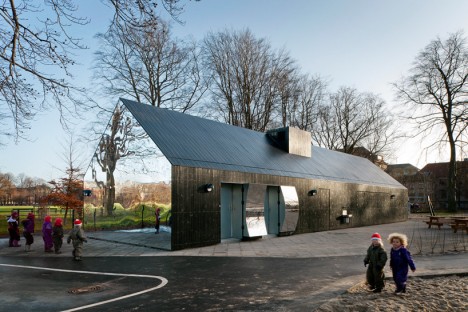
Not stupid and pretentious?
__________________
2016 2017 2018 2019 2020 Member of the Year & Journal of the Year Champion Behold the Writing of THE LEGEND: https://www.musicbanter.com/members-...p-lighter.html |
10-04-2017, 07:17 AM | #53 (permalink) | |
...here to hear...
Join Date: Nov 2010
Location: He lives on Love Street
Posts: 4,444
|
Quote:
^ No, just super-cool and innovative in my opinion - although it doesn't seem to have a handrail and probably breaks about a zillion safety codes.
__________________
"Am I enjoying this moment? I know of it and perhaps that is enough." - Sybille Bedford, 1953 |
|
10-08-2017, 08:37 AM | #54 (permalink) |
...here to hear...
Join Date: Nov 2010
Location: He lives on Love Street
Posts: 4,444
|
How should a building look ?
If you think the principal goal is to catch people's attention, this one must count as a winner. It's in Melbourne, and it exploits a famous optical illusion; although it doesn't look that way, all those thin orange lines are parallel. You can check it yourself (as I did); your eyes may say "no" but your ruler will say "yes." For me, it's a bit too much, and the ground floor of the long side just looks like a mess of electrical transformer boxes or something, painted in airport-safety orange. One feature I quite like are the blue circles that look struck-on and not related to the facade. I'd like to see more of those, perhaps in different sizes. And if they were made to be movable, they could be slid around the facade by a strong guy with a very long pole. That would surely catch people's attention.
__________________
"Am I enjoying this moment? I know of it and perhaps that is enough." - Sybille Bedford, 1953 |
10-08-2017, 08:58 AM | #55 (permalink) |
Account Disabled
Join Date: Nov 2012
Location: The Black Country
Posts: 8,827
|
Subjective innit? I like the Victorian and Gothic style architecture but I like a lot of the modern build stuff too. I don't like that building you just posted but not because it stands out or because of the design, it's mainly because the cladding looks cheap.
One thing I really hate is the brutalist style of architecture. I just cannot see how that style is appealing to anybody. |
10-08-2017, 09:03 AM | #56 (permalink) |
Account Disabled
Join Date: Nov 2012
Location: The Black Country
Posts: 8,827
|
Though I could imagine the Melbourne illusion building really working if it was in a section of the city surrounded by other eye catching buildings and public art, like an area for clubs, bars and shopping. Graffiti art and stuff. I could see that being really attractive.
|
10-08-2017, 09:13 AM | #57 (permalink) |
...here to hear...
Join Date: Nov 2010
Location: He lives on Love Street
Posts: 4,444
|
Yes, I like those old styles too, with all the care and detail that was put into them. I'm not opposed to modern architecture, though I don't see much that I like, tbh.
I think the Brutalist style would've been ok if there were just 3 good examples of it on the whole planet. The same with the Glass Box - a handful of good-quality examples would've been sufficient, but instead we have them like a plague in every city, and more often than not "the cladding looks cheap." After all, if the cladding is all we have to look at, let's make it decent! EDIT: Not sure where the Melbourne building is, but it doesn't look very interesting to me; carparks, fences, and some office buildings behind.
__________________
"Am I enjoying this moment? I know of it and perhaps that is enough." - Sybille Bedford, 1953 |
10-08-2017, 09:37 AM | #58 (permalink) |
...here to hear...
Join Date: Nov 2010
Location: He lives on Love Street
Posts: 4,444
|
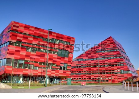
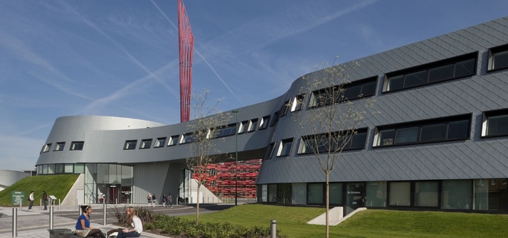
A friend of mine once walked me round the Jubilee Campus of Nottingham University, which I think you would have enjoyed too, MLM. Of course, it doesn't hurt that the new buildings are set in a car-free area of grass and wáter. Also the site is big enough to give space and dignity to each building even though their styles are so different:
..... or take the drone tour:-
__________________
"Am I enjoying this moment? I know of it and perhaps that is enough." - Sybille Bedford, 1953 Last edited by Lisnaholic; 10-08-2017 at 09:56 AM. |
10-08-2017, 09:47 AM | #59 (permalink) |
OQB
Join Date: Mar 2015
Location: Frownland
Posts: 8,831
|
the third one down is brilliant. love how smooth it looks. the grass hill on the far side is nice as well.
__________________
Music Blog / RYM / Last.fm / Qwertyy's Journal of Music Reviews and Other Assorted Ramblings |
10-08-2017, 10:19 AM | #60 (permalink) |
...here to hear...
Join Date: Nov 2010
Location: He lives on Love Street
Posts: 4,444
|
Yeah, I like that one too, Qwertyy. It has a very pleasing shape, which you can see clearly in the video clip. I like how the building is a bridge too.
__________________
"Am I enjoying this moment? I know of it and perhaps that is enough." - Sybille Bedford, 1953 |
|