|
Register | Blogging | Today's Posts | Search |
|
Thread Tools | Display Modes |
10-01-2017, 10:26 AM | #21 (permalink) | |
...here to hear...
Join Date: Nov 2010
Location: He lives on Love Street
Posts: 4,444
|
Quote:
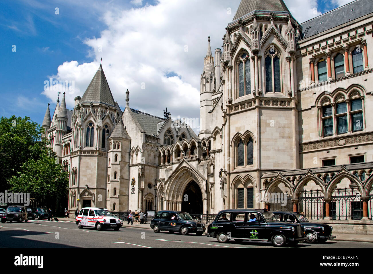
Two of my fave brick churches. This one in London:- The next is Watts Cemetery chapel, tucked away in a little-visited corner of the countryside about three hours from London; I still remember the feeling of surprise I felt when I first came across it by chance while cycling down a country lane. The floor plan is just a cross superimposed on a circle and in the middle of this photo you can see one quarter of the curved wall, so you can imagine how, out of sight, it repeats itself at the back, in perfect symmetry. And notice how, at about first-floor level, there is a band of decoration on the curved wall? There are similar decorative panels running vertically down the stubby ends of the cross walls. .......................................... Well, each one of those decorative terracotta panels is a work of art in itself: here's a photo of one, close up. What I particularly like is that the decorator has given up any pretense of depicting conventional Christian symbols. It's like he's saying, "Forget the religion, this is art!"
__________________
"Am I enjoying this moment? I know of it and perhaps that is enough." - Sybille Bedford, 1953 |
|
10-01-2017, 10:50 AM | #22 (permalink) |
Account Disabled
Join Date: Aug 2015
Location: Aalborg
Posts: 7,634
|
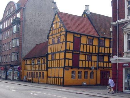
I really like medieval looking architecture and thankfully, the city I live in has a fair bit of very old buildings. The midtown area of Aalborg is a curious mix of hundreds of years old architechture and modern architechture. I tried to find a picture from Aalborg that would show how it's a mix of old and new. This was the best I could find:
A couple more pics of old and new in my town: I'm not religious, but I really like churches. Here's the Budolfi Church at the heart of Aalborg. The white chalk paint is typical of old Danish churches. There's usually a lot of wood work inside, but these churches aren't as amazingly illustrated inside as the ones you often see further south in Europe. Last edited by MicShazam; 10-01-2017 at 10:56 AM. |
10-01-2017, 11:24 AM | #23 (permalink) |
OQB
Join Date: Mar 2015
Location: Frownland
Posts: 8,831
|
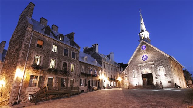
back in grade school we made a trip to Vieux Quebec, a lot of really cool older style buildings there.
Spoiler for pics:
__________________
Music Blog / RYM / Last.fm / Qwertyy's Journal of Music Reviews and Other Assorted Ramblings |
10-01-2017, 04:35 PM | #28 (permalink) |
one-balled nipple jockey
Join Date: Dec 2010
Location: Dirty Souf Biatch
Posts: 22,006
|
Spoiler for Dogon:
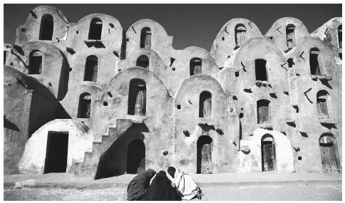
Spoiler for Tunisia:
Spoiler for Algeria:
__________________
2016 2017 2018 2019 2020 Member of the Year & Journal of the Year Champion Behold the Writing of THE LEGEND: https://www.musicbanter.com/members-...p-lighter.html |
10-01-2017, 05:32 PM | #29 (permalink) | |
...here to hear...
Join Date: Nov 2010
Location: He lives on Love Street
Posts: 4,444
|
^ Thanks, MLM, but I'd give the win to your Birmingham Law Courts to be honest.
More importantly, thanks for opening this thread; I also love walking around looking at buildings, so when I saw this thread I thought, "Aha! A true kindred spirit!" ^ Yes, this building is wonderful. I love it when an architect uses colours but not paint. Here the natural colours of the materials compliment each other so well; the brick, the stone and the copper(?) of the roof. Quote:
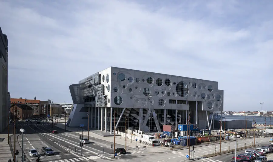
I was also very interested in your photos of Aarlborg with it's mixture of old and new. It looks like an attractive city, and to me that's one of the big challenges for architects today; putting something that is clearly new into a city of old buildings and making a kind of harmonious contrast. On that count, I'm sorry to say that I don't share MLM's opinion of London's "Gerkin." Sorry, MLM, but it's actually one of my least favourite additions to London; the drab surface of glass, the lack of interesting detail, but mostly the shape. Bad enough that everyone immediately thinks "penis", what's worse is that it disregards all the language of straight lines with which it is surrounded. The size of it is also an issue with me; if it was shrunk down to the size of a telephone box, I think I could live with it appearing on a streetcorner, or as an ATM kiosk in front of a bank. If you're going to put curves into buildings, I prefer to see them used more discreetly. This building, for example, has quite simple geometry that neatly accomodates just a couple of curves within its straight lines:-
__________________
"Am I enjoying this moment? I know of it and perhaps that is enough." - Sybille Bedford, 1953 |
|
10-01-2017, 05:42 PM | #30 (permalink) |
...here to hear...
Join Date: Nov 2010
Location: He lives on Love Street
Posts: 4,444
|
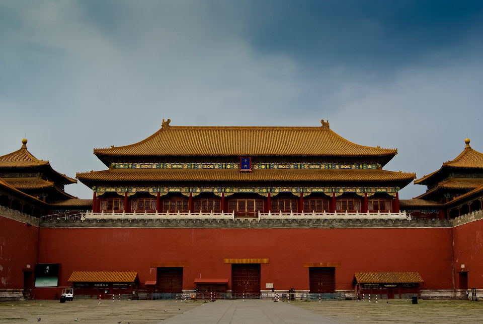
Nice buildings, Occult Hawk...EDIT: Sorry, Wpnfire, but for some reason the oriental style has never appealed to me - apart from the Great Wall of China, which is undecorated of course.
__________________
"Am I enjoying this moment? I know of it and perhaps that is enough." - Sybille Bedford, 1953 |
|