|
Register | Blogging | Today's Posts | Search |
|
Thread Tools | Display Modes |
07-10-2012, 09:05 PM | #21 (permalink) | |
Music Addict
Join Date: Jun 2012
Location: Ontario, Canada
Posts: 171
|
Quote:
Reminds me of X-Men vs. regular humans. I can just see it. Synesthetes holding signs saying "We don't need a cure!" haha. |
|
07-10-2012, 09:09 PM | #22 (permalink) |
Music Addict
Join Date: Sep 2010
Posts: 5,184
|
I thought the first post established that the visualization of colour is an inspired thought process, not a hallucination. I don't literally see the world change colour, but certain things have very strong colour associations that I make in my mind.
|
07-10-2012, 10:15 PM | #23 (permalink) |
Music Addict
Join Date: Jun 2012
Location: Ontario, Canada
Posts: 171
|
From what I understand, there are various ways a person can experience visualizations of colour. The synesthetic way being automatic and uncontrollable (thus classified as a "condition"), the cognitive way being creative and imagined (and therefore accessible to anyone with a good abstract/ metaphorical imagination, where colors can be used as metaphorical depictions of sound and other senses), and the hallucinatory way which is achieved either through the use of drugs or the experience of psychological illness.
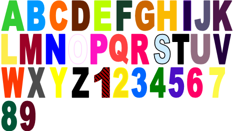
So, really, it all depends on whether the colors you see are inspired in your mind by conscious or semi-conscious effort, or if they are innate and occur automatically, without any outside influence. There are various theories surrounding these experiences, but so far they are only preliminary (again, as far as I know). All of the experiences mentioned so far have been either truly synesthetic, or at least similar to synesthesia in that they were consciously imagined in a similar way. Whether they are talking bull or not, it's interesting to hear what people imagine in relation to sound, no matter how the experience came about. (although I'm opposed to recreational drugs! So don't take that as advice haha) As for actually seeing the world changing color, true synesthetes will see black letters like the ones I just typed with "ghosts" of color "on top" of them (an image in their mind, and not actually truly visible in the outside world). For me, the words "black letters" look roughly like this: black letters This is an uncontrollable experience, and the colors associated with each letter have been consistent and unchanged for as long as I can remember. |
07-10-2012, 10:46 PM | #25 (permalink) |
Music Addict
Join Date: Jun 2012
Location: Ontario, Canada
Posts: 171
|
I know, right? It's like OCD that way. Other synesthetes' colors can be a bit annoying. For me it's worse than bad spelling. But I liked everyone's music descriptions for some reason. Interesting... Do you get annoyed when the colors are wrong in logos or ads, or just in normal writing/type? |
07-10-2012, 11:43 PM | #26 (permalink) |
Groupie
Join Date: Jul 2012
Posts: 1
|
This is a virtual image that create in the mind when we listen music By all means (concentrete ) the image and the visualization create with the music . I like listen music and many time the mind setup feel this audio codecs is the MusicBuilding in a qualitative music , i mean in best clearity of sound.
|
07-11-2012, 09:59 AM | #27 (permalink) | |
Music Addict
Join Date: Sep 2010
Posts: 5,184
|
Quote:
I once tried to make a chart in photoshop of the alphabet as I coloured it, and found that the shades had to be very precise to "feel" accurate. It isn't enough for instance, to say that M was red, because I have an exact idea of which shade of red it should be. |
|
07-11-2012, 04:46 PM | #29 (permalink) | |
Music Addict
Join Date: Jun 2012
Location: Ontario, Canada
Posts: 171
|
Quote:
In my name, the individual letters would look somewhat like this: (Enough to give me a headache) But all together, the word looks more like this, with the blue/grey color of the J affecting all the other letters, creating a more subtle overall picture. Stronger letters, like the a's and t's can withstand being affected, but "weaker" letters, like h, fade into the background. The letters tend to get less clear further from the first letter. And that's without the complexity of the backdrop, which would be impossible to actually replicate. I also see M as red; a really saturated, deep "cool" red (more on the blue side than the yellow side). Do you still have the chart? It's easy to get frustrated trying to create a good representation. The example I gave seems incomplete for me. If only there were videotapes for the mind. |
|
07-11-2012, 06:13 PM | #30 (permalink) |
Music Addict
Join Date: Sep 2010
Posts: 5,184
|
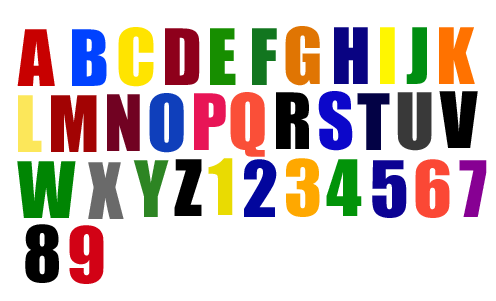
Here is the unsatisfactory chart I made a few months ago. I didn't spend a lot of time with it, so it's not very accurate, and a few of the colours I settled on still bother me. Screen brightness and things affect something you make in photoshop, so it's difficult for me to get it right.
I did not take fonts into consideration. |