Quote:
Originally Posted by James

Worst album art of any band ever. So much cheese.
|
I absolutely disagree. Marillion, at least for the first four albums, were trying to recapture the sort of art that characterised album covers of early prog acts in the seventies and before. Their covers always told a story, were beautifully drawn and always, imo, added to the overall experience you got from the album. They also follow a story, as detailed somewhat in my first "Secret life of the album cover" feature in my journal.
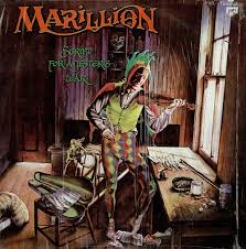
Debut: "Script for a jester's tear" shows essentially an artist struggling with his songs/writing, wishing he could show the world how talented he is but being ignored. There's lots of imagery on the cover to support this, not least the sad face of the jester, who would become Marillion's sigil for four albums, almost.

Second album: "Fugazi" shows the jester having achieved fame but still dogged by the doubts, fears, uncertainties and expectations which haunted him on the debut. Now he's famous, his music is known, but is he happy? Stretched out on a bed in a lonely bedsit, drunk and possibly drugged, he's far from happy. Moral: money does not buy happiness (short version: for a more in-depth analysis see my journal).
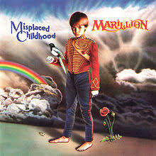
Third album: "Misplaced childhood". The last to feature the full jester, the album cover is actually taken over by the child who represents the title, and the jester is seen escaping out the window: time to give up childish things?
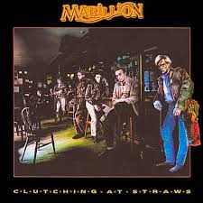
Fourth album, last with Fish: "Clutching at straws". A concept album based loosely around the idea of alcoholism, the cover shows a man standing at the end of a bar, looking totally dejected and lost, the only sign of the jester the cap protruding from his pocket.
After this, with the departure of Fish as lead vocalist, Mark Wilkinson, who created the art for the first two albums, would go with him and work on his solo albums, and Marillion would adopt a more "modern" approach to sleeve art, varying it with little or no connection between each cover over the years.
To call Marillion's album covers cheesy is to deny the thought and the hard work that went into creating them. If you want to call them cheesy, then all the Yes, Rush, Asia, Zep, and a hundred other prog rock artists albums have to be accused of this as well.
Album art is a dying, erm, art, and I think it was great to see Marillion trying to keep it alive during the eighties.